Artwork 1: Still
Lucky Horses - Ma Dao Thanh Cong
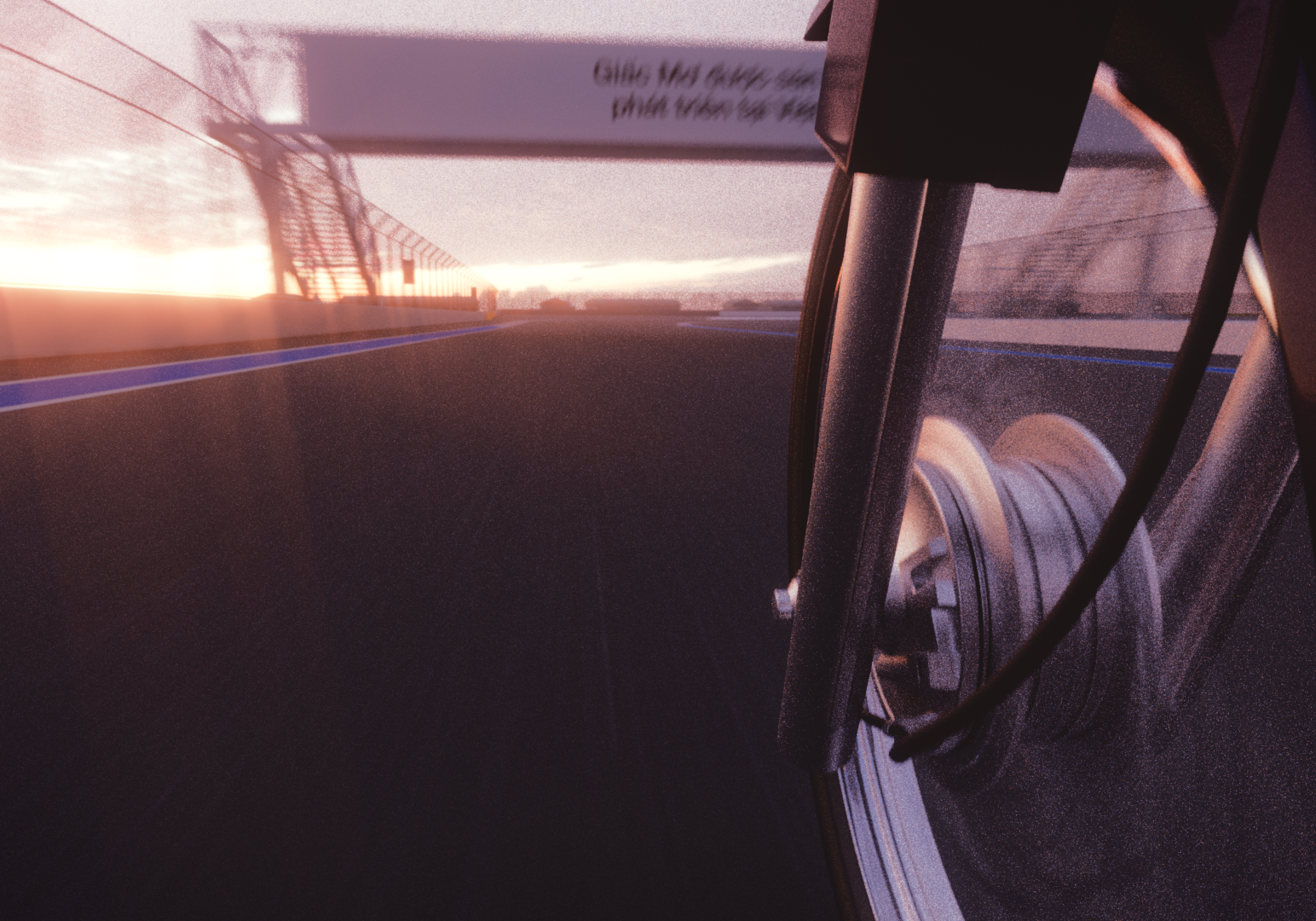
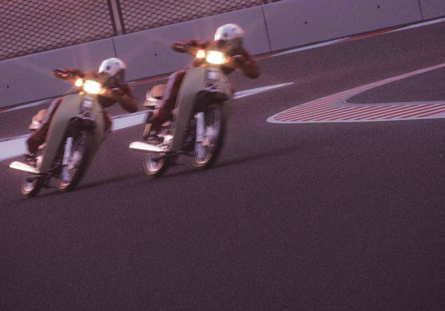
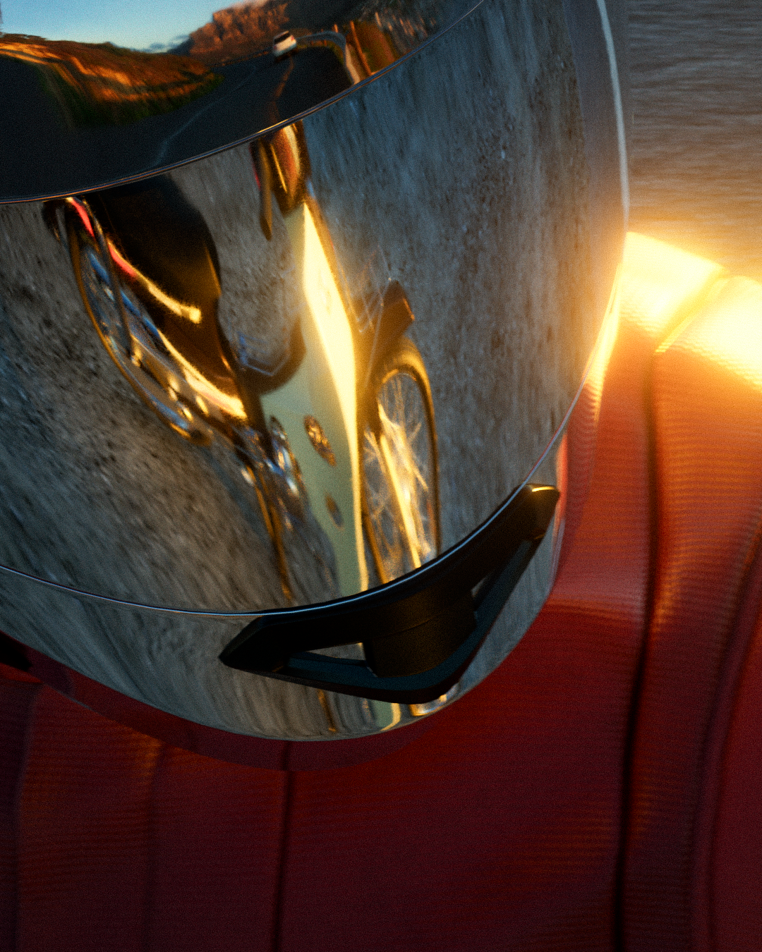
Dream II
Passion Project
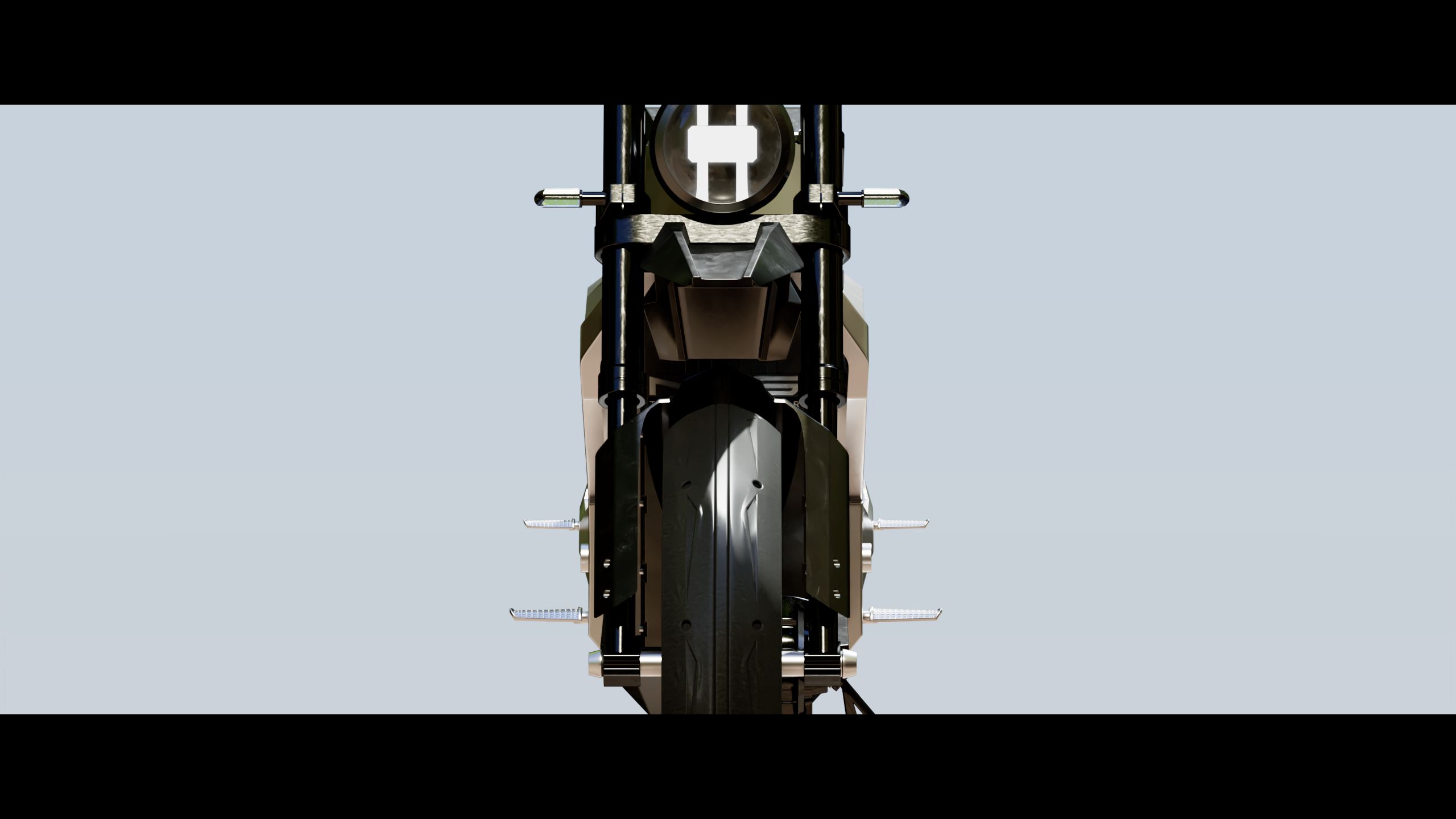
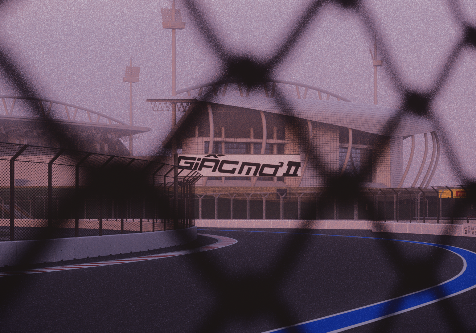
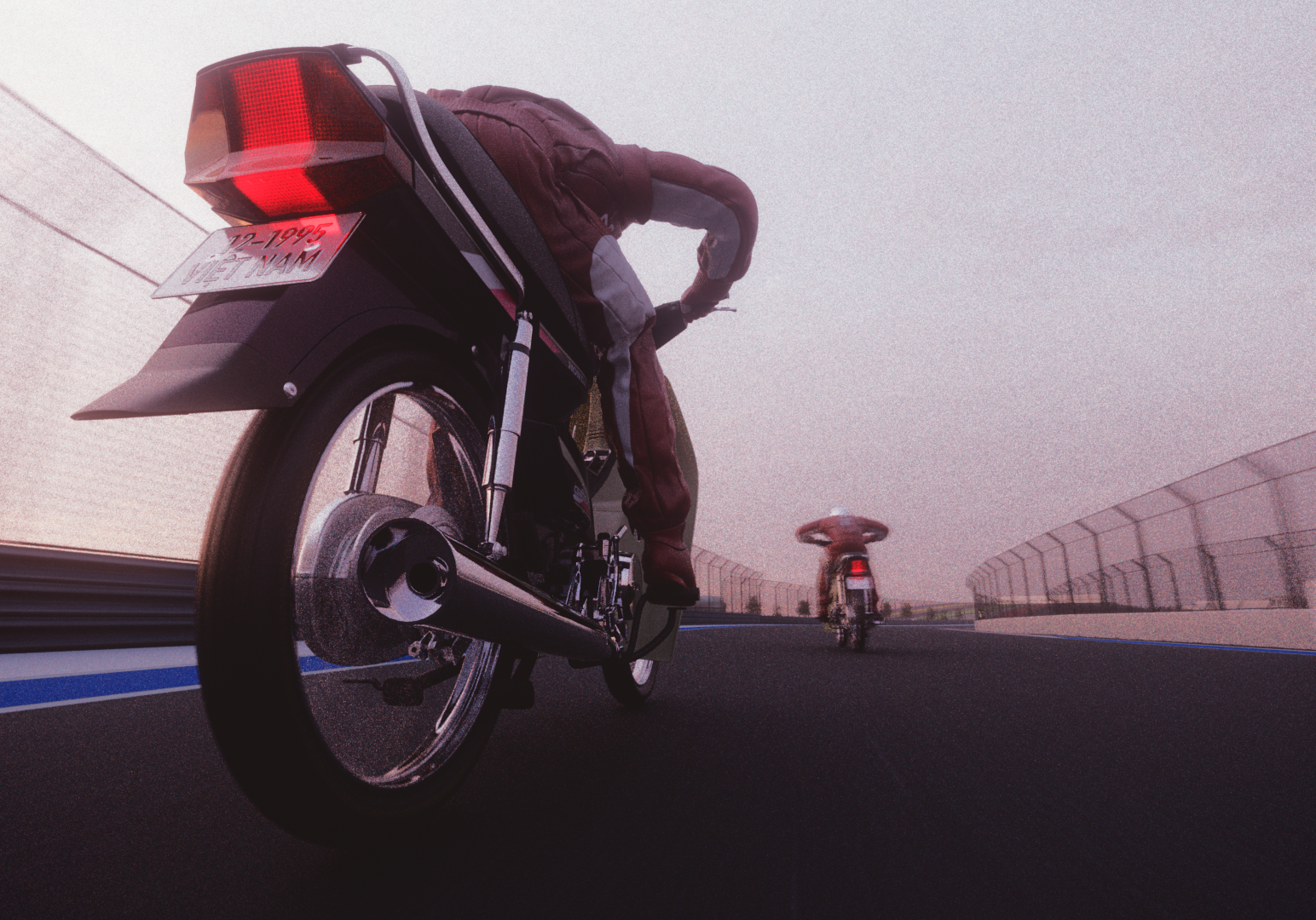
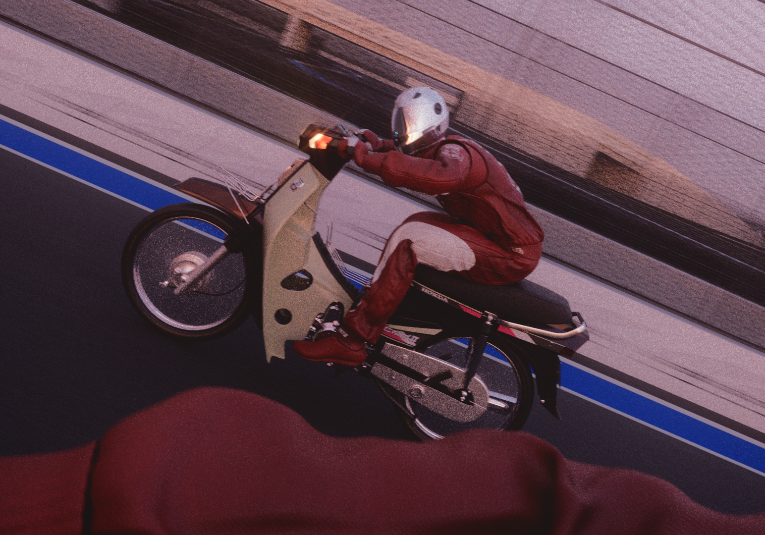
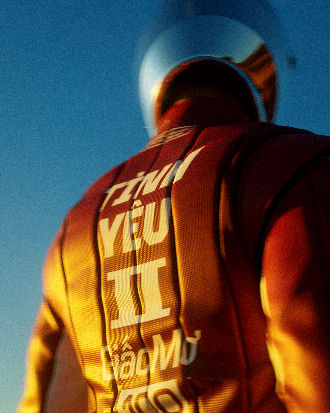
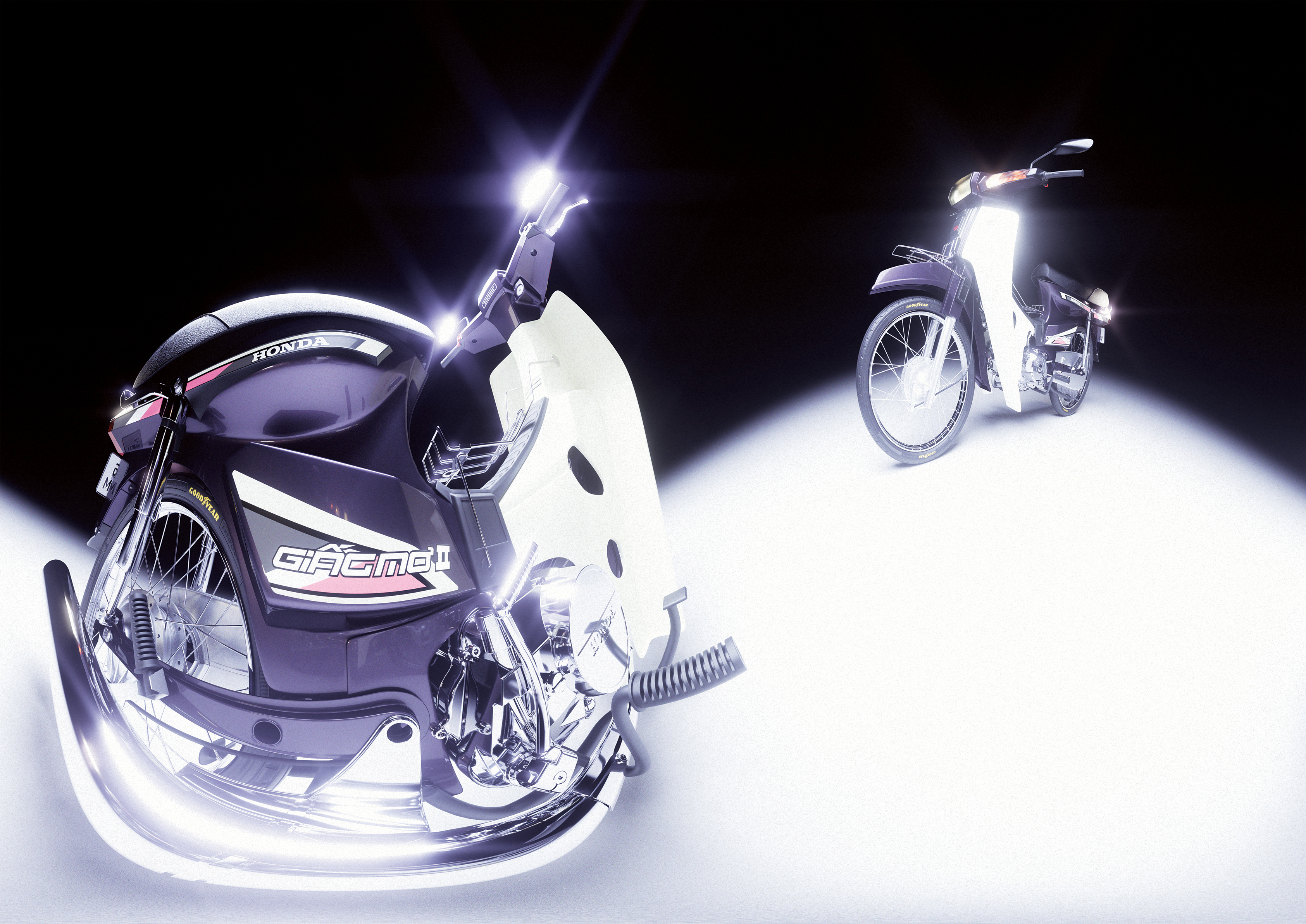
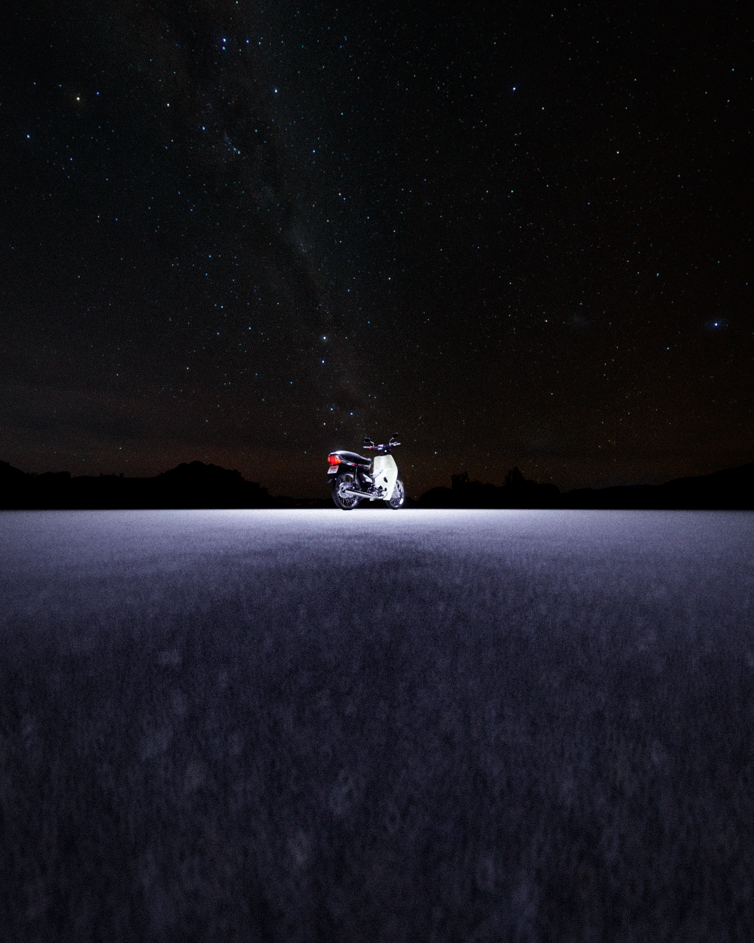
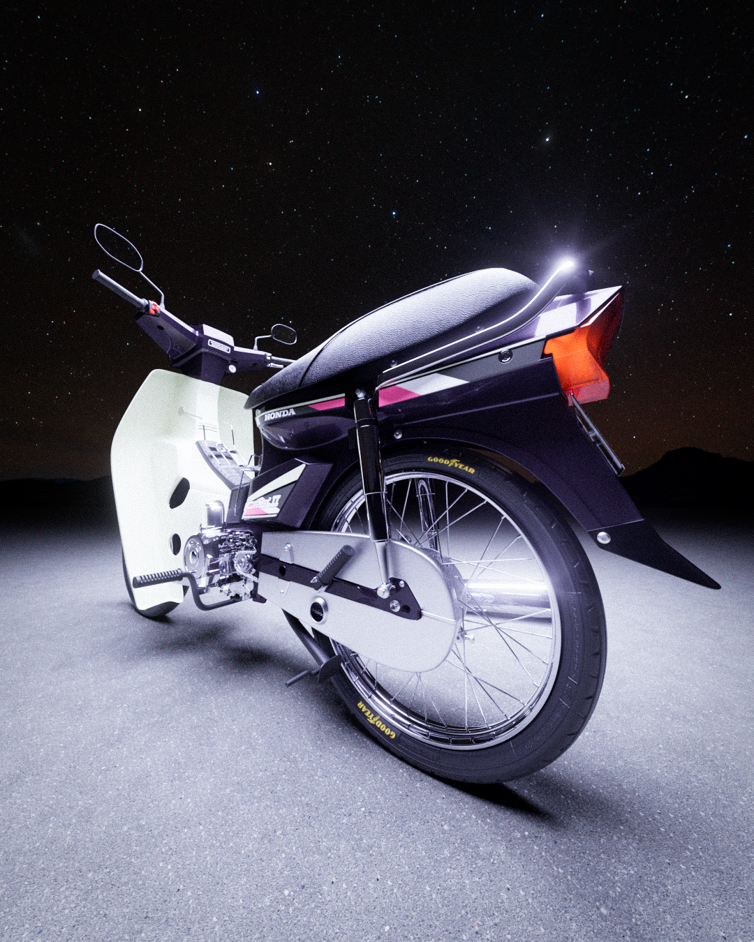
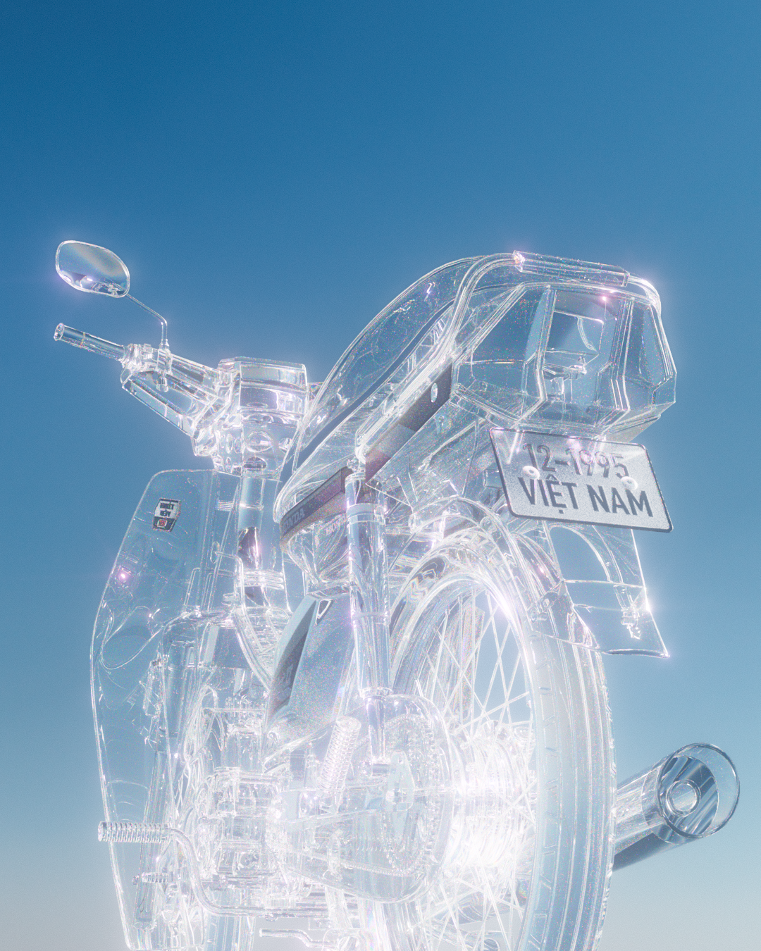
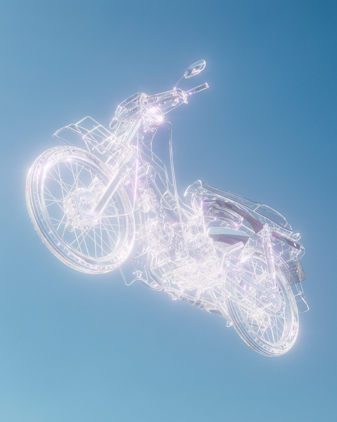
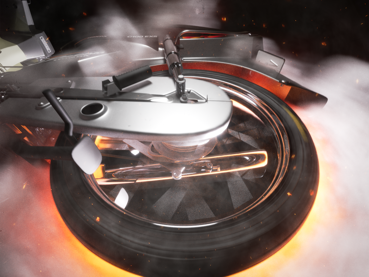
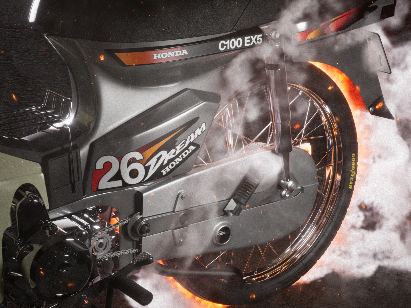
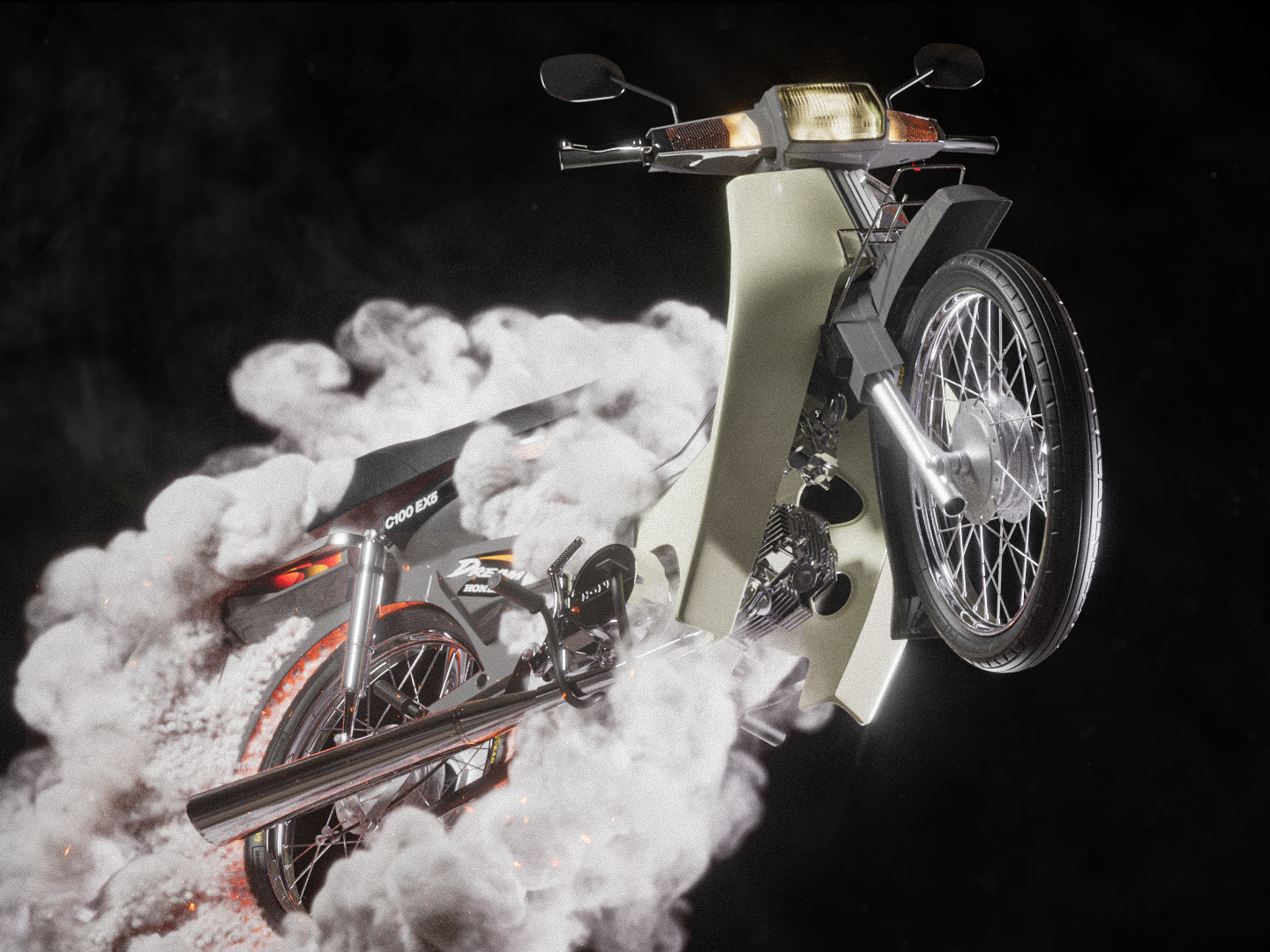
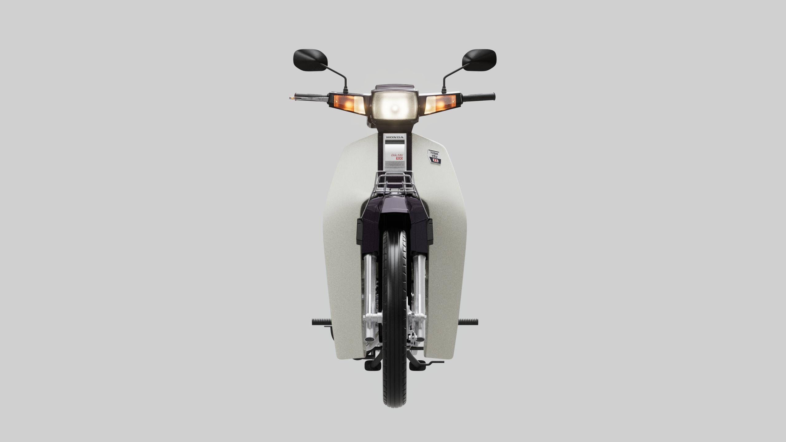
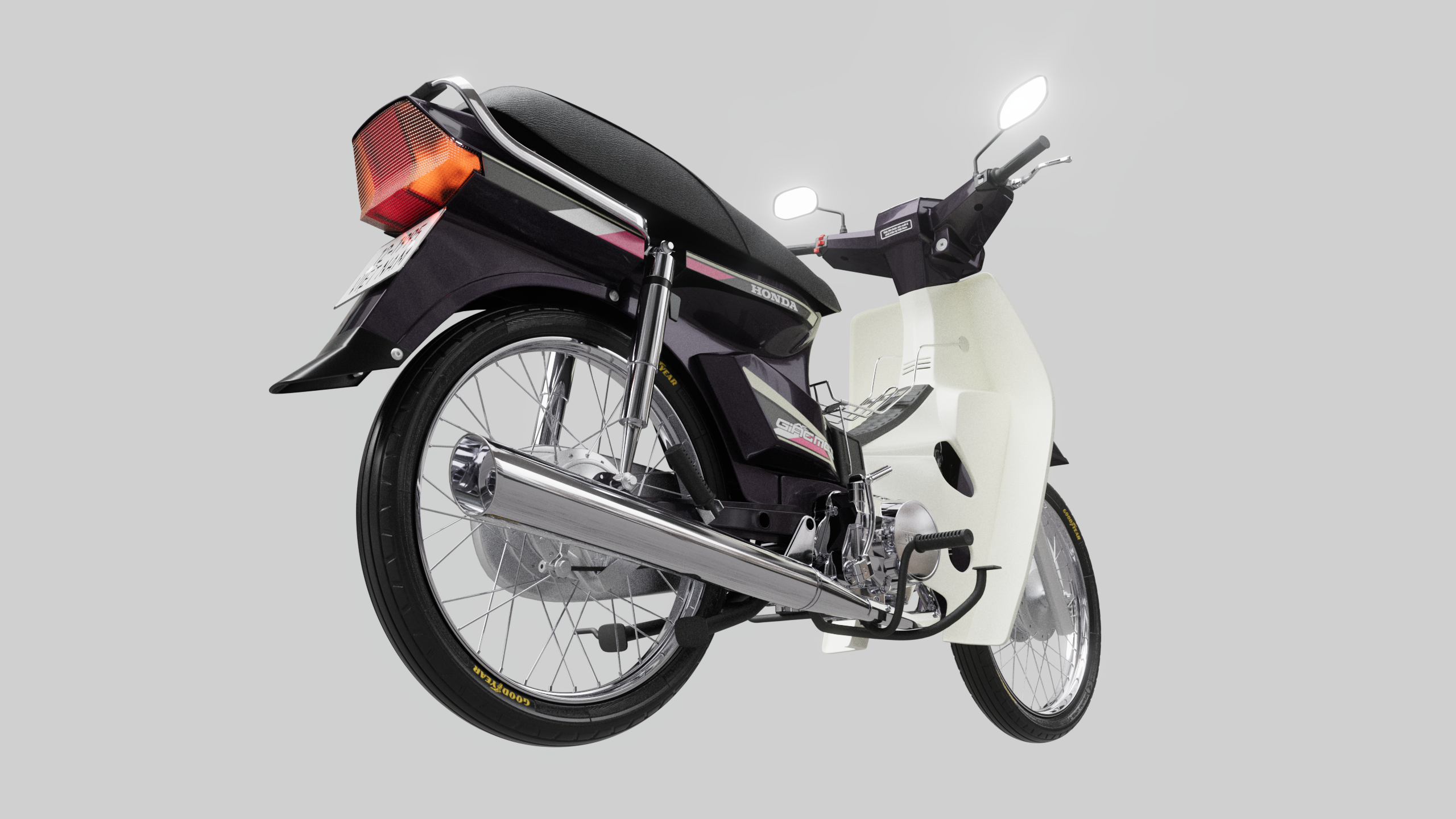
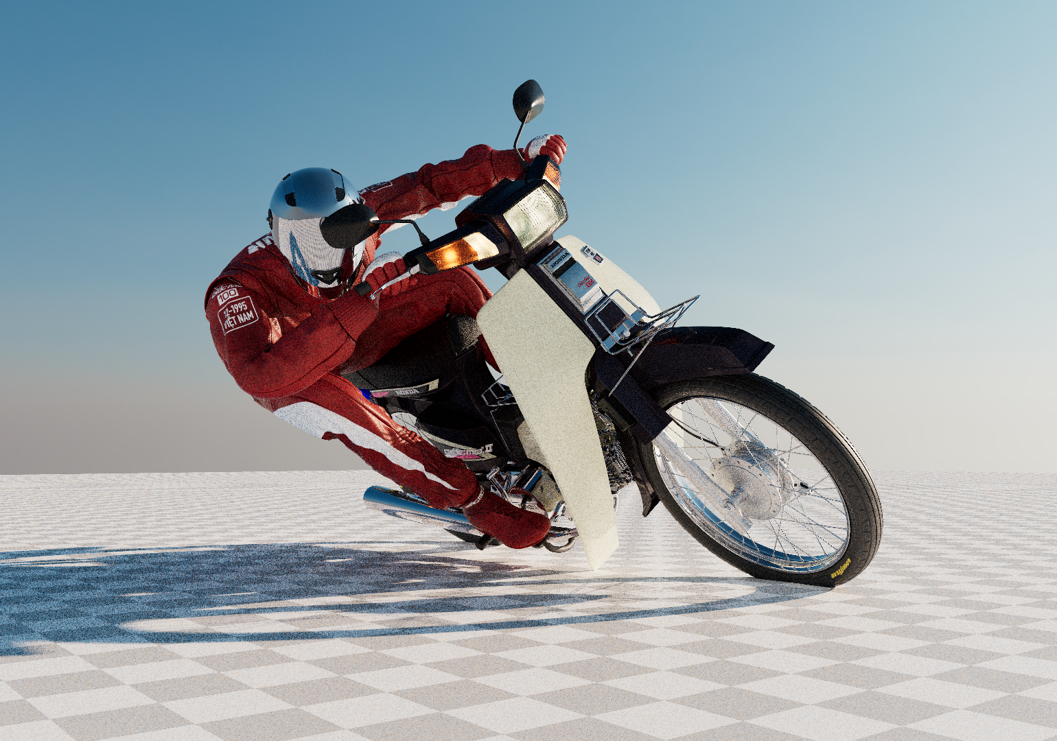
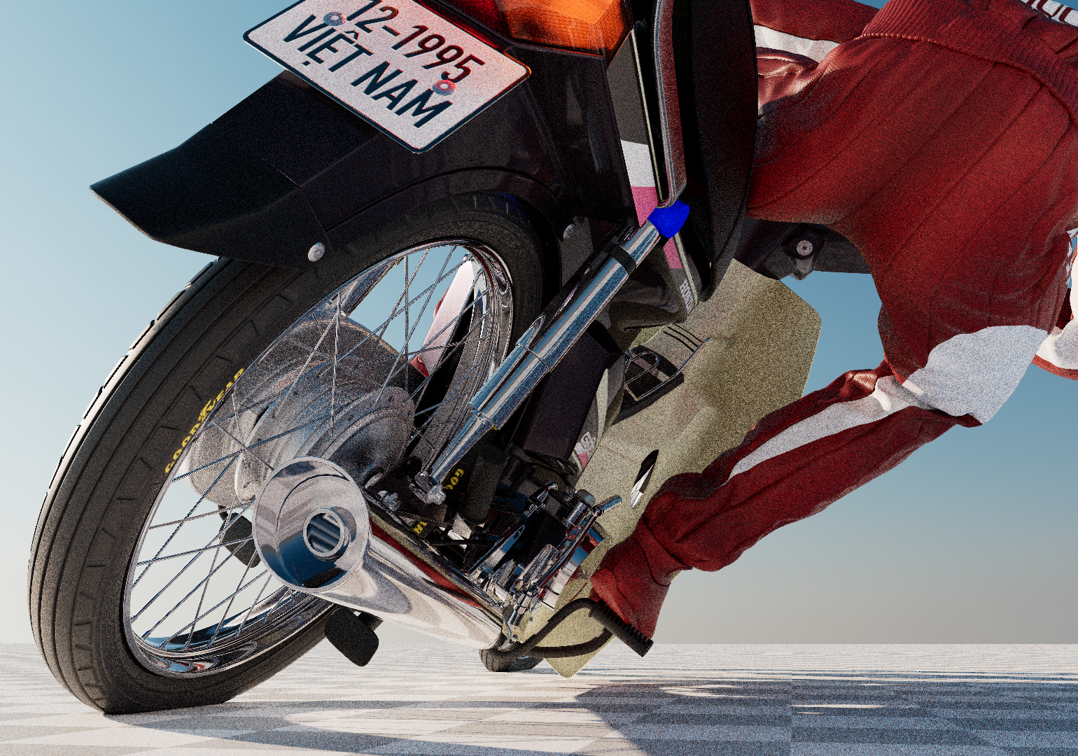
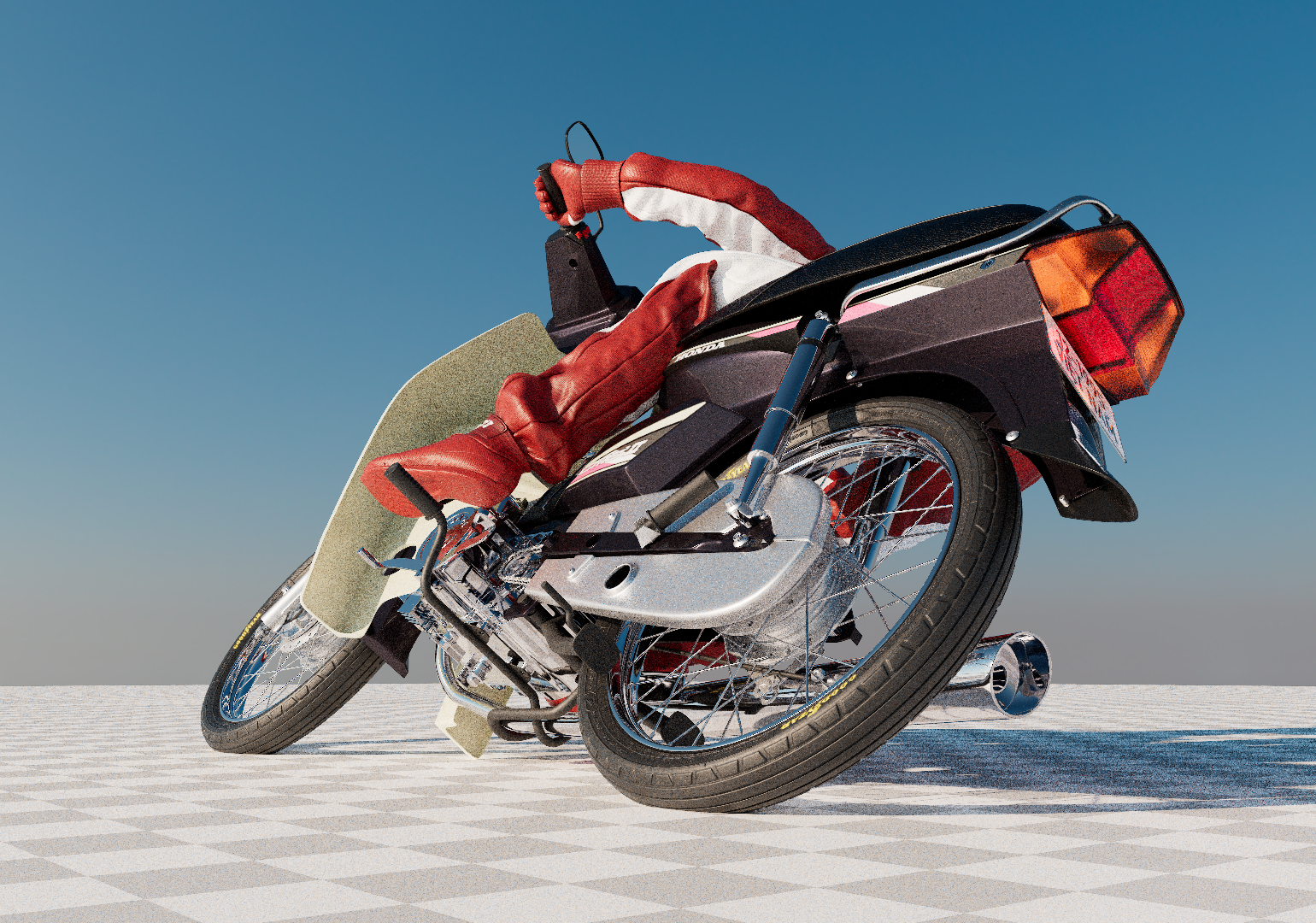
Dream II (Giac Mo II) is a series of artworks created to reflect the perspective of the younger generation on the first-generation Honda Dream — a motorbike that was first imported into Vietnam decades ago. The vehicle is seen as a symbol of youthful dreams and ambitions, an enduring image through time. This piece captures the intimate moment of contemplating that dream up close, magnifying both the beauty of the motorbike and the deep desire to reach one’s aspirations.
This project takes the familiar shape of a simple Honda Dream and reimagines it in a dream-like world, turning an ordinary object into something surreal — something that reflects the idea of an ideal desire.
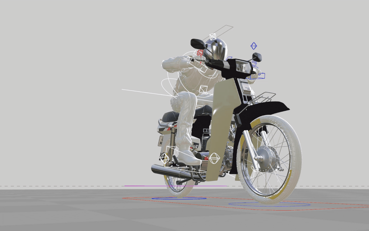
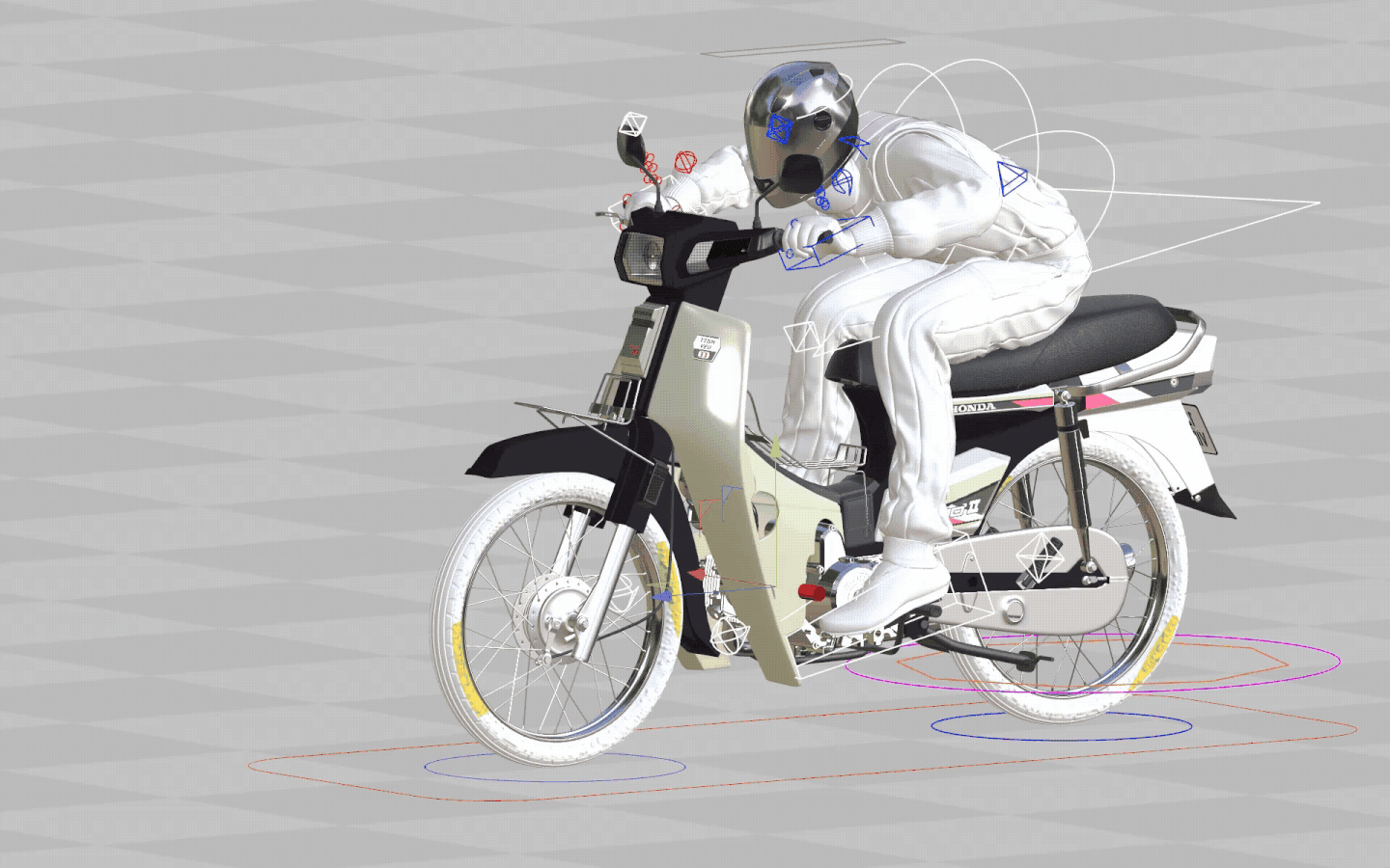
It’s the most ambitious project I’ve created so far, pushing me in both visual storytelling and the craft of 3D production. Working on it gave me the space to explore the full production process from early concepts and storyboards to modeling, rigging, texturing, look development, rendering, and animation. It was a chance to refine my skillset as a generalist 3D artist.
This project takes the familiar shape of a simple Honda Dream and reimagines it in a dream-like world, turning an ordinary object into something surreal — something that reflects the idea of an ideal desire.
It’s the most ambitious project I’ve created so far, pushing me in both visual storytelling and the craft of 3D production. Working on it gave me the space to explore the full production process from early concepts and storyboards to modeling, rigging, texturing, look development, rendering, and animation. It was a chance to refine my skillset as a generalist 3D artist.


Artwork 2: Animation
DreamChasing


Artwork 3: Still
DreamChaser
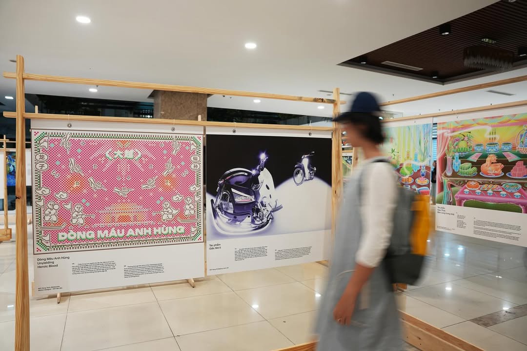
This artwork looks at the motorbike from a fresh perspective—how we see it, what it represents, and the way it ties into the core memories of a generation. It was later featured in Ngóc Ngách – Core Memories, an augmented reality art and design exhibition organized by Field Design Collective. There, the Dream stepped beyond the digital screen and became an interactive AR experience, letting the audience connect with it in a more personal and immersive way.

Artwork 4: Still/Animation
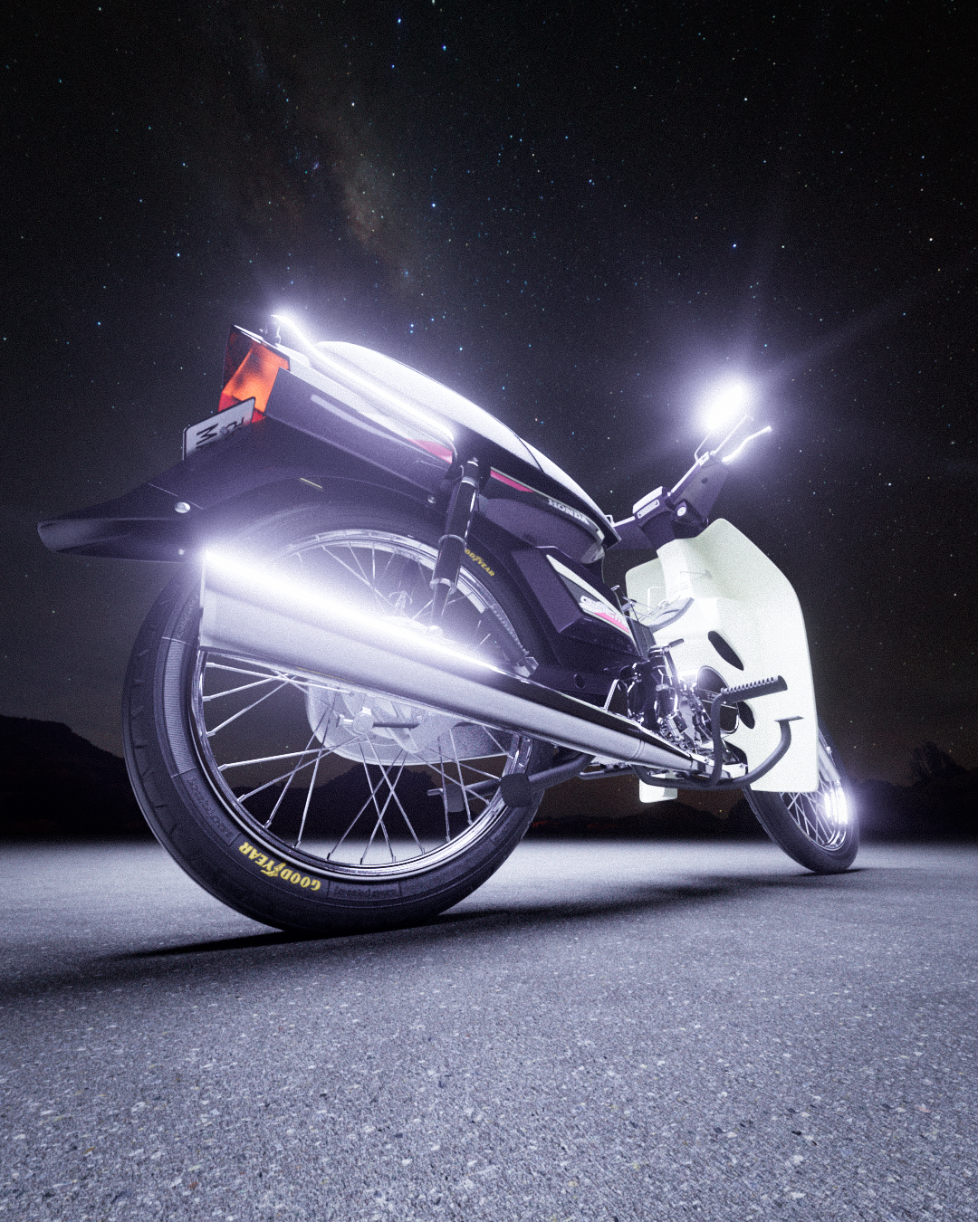
Dream II (Giac Mo II)

Artwork 5: Still
WildDream
Artwork 6: Still
DayDream
Artwork 7: Still
Dream II_Year of the Horse 2026


Artwork 8:
Dream II_Red Flamboyant
The Making Of
To model the Dream as accurately as possible, I relied on an official Honda catalog that showed every assembly step and detailed each parts LINK. From major components down to tiny nuts and bolts. Along with reference photos of my father’s bike. The whole process took around six months, mostly done in my free time and after work. Working at this pace gave me the chance to focus on the details and stay true to the original design of the Dream. The final result is a clean, almost accurate base model that I can continue customizing and building on in future variations.


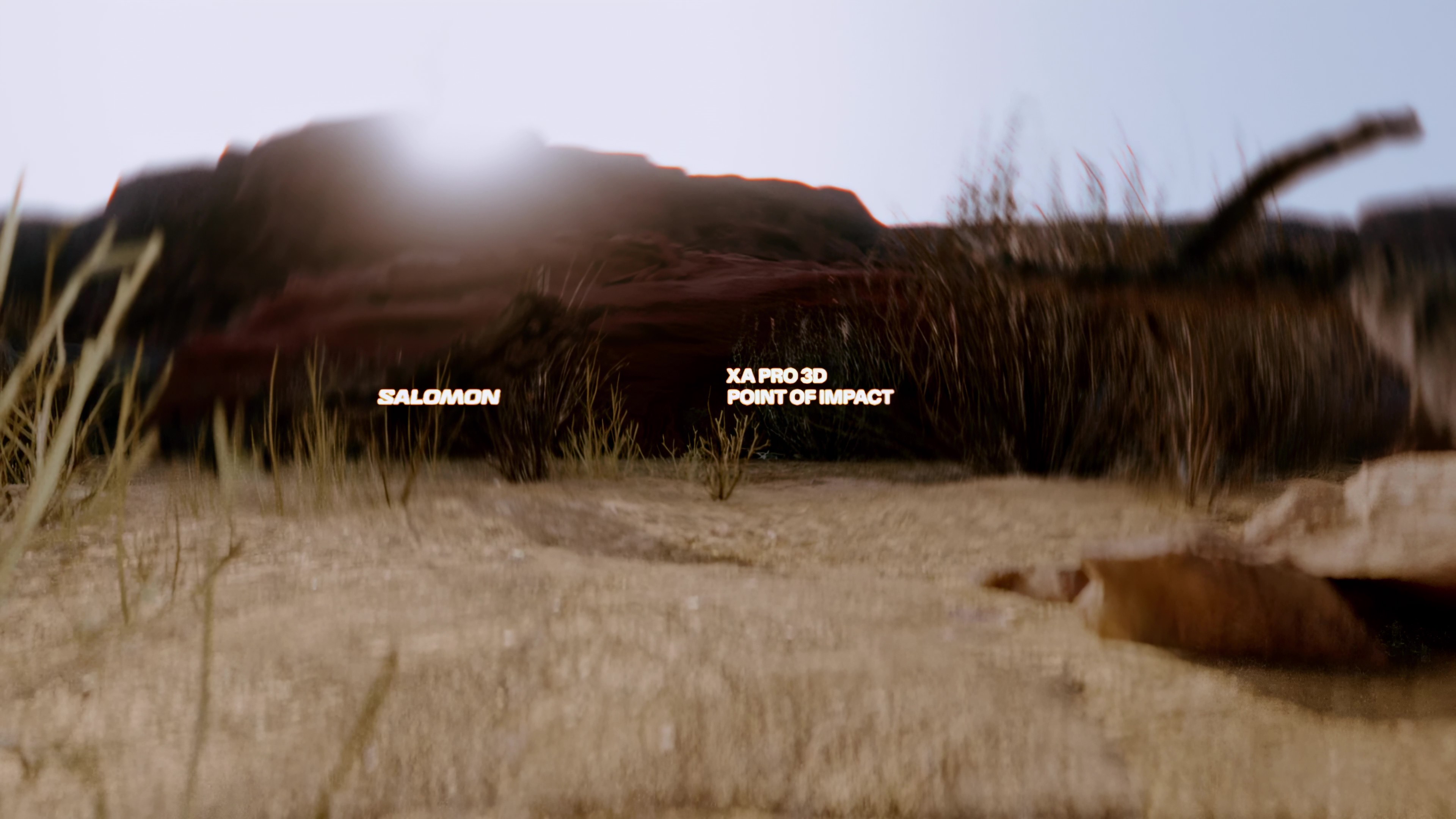
Salomon XA Pro 3D
Point of Impact
Point of Impact
Speculative work
Salomon
Collaboration
Huy Le - 3D Motion Designer
Model
MaX-MaN (CG Trader)
Salomon
Collaboration
Huy Le - 3D Motion Designer
Model
MaX-MaN (CG Trader)
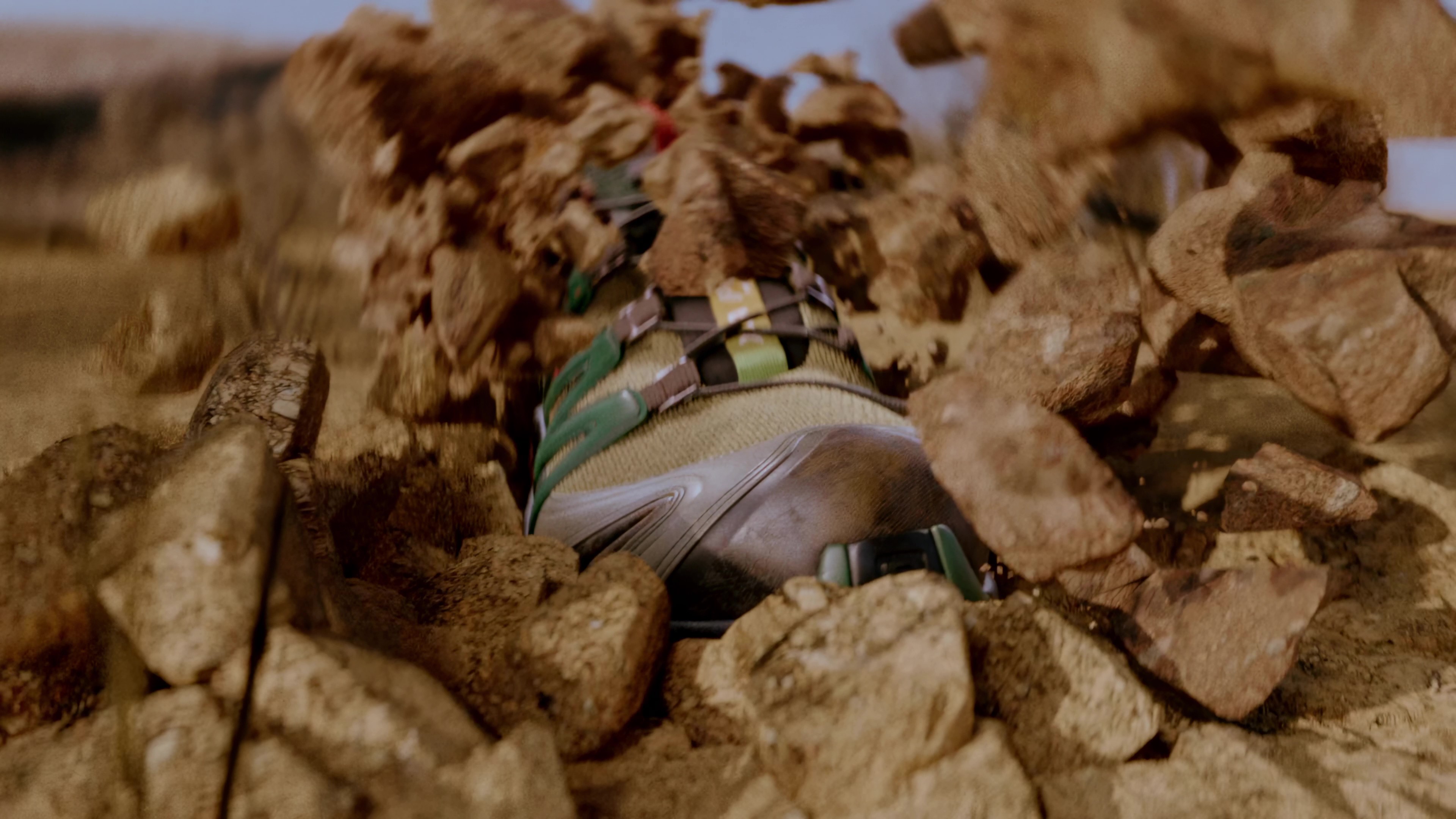
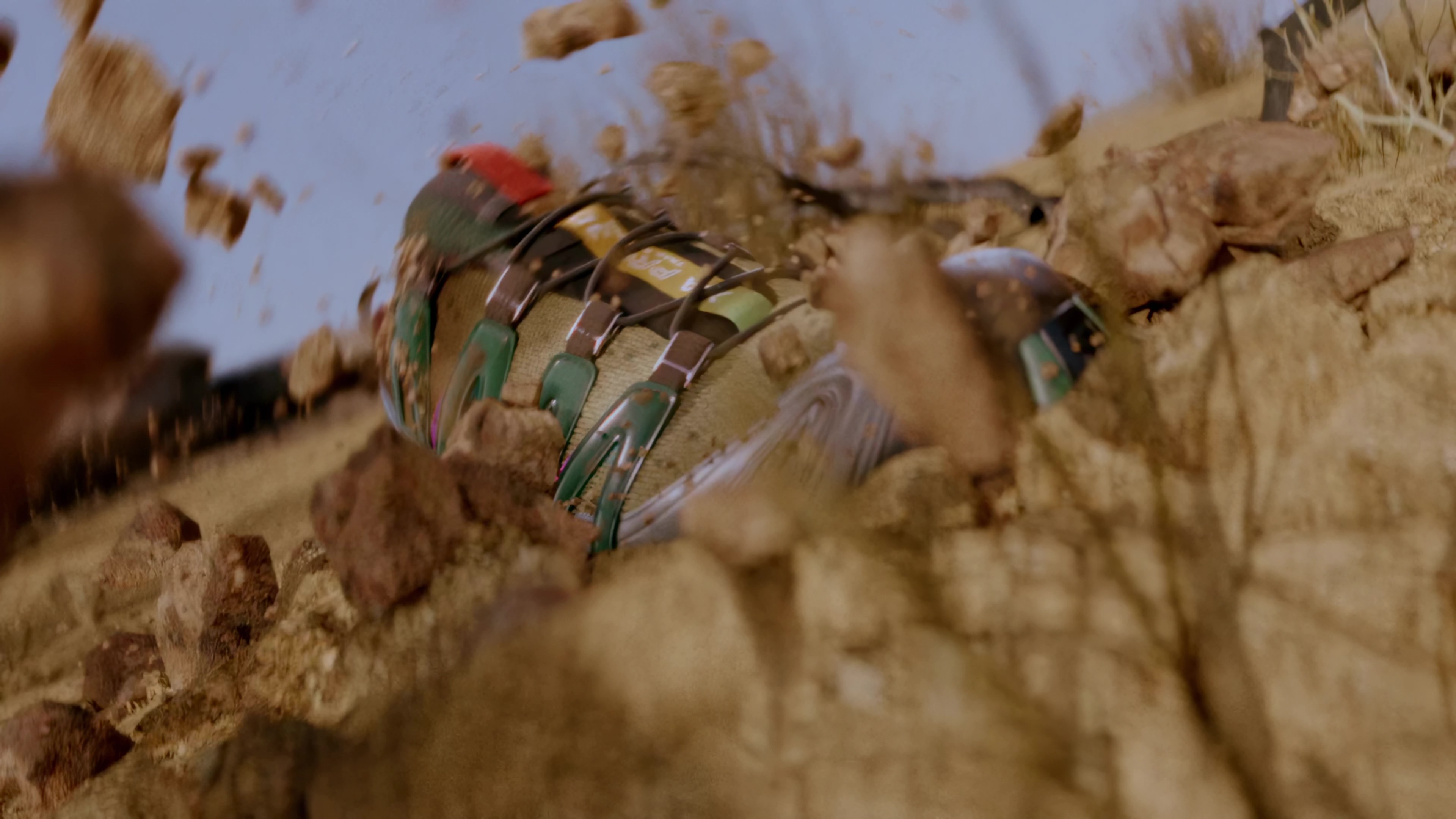
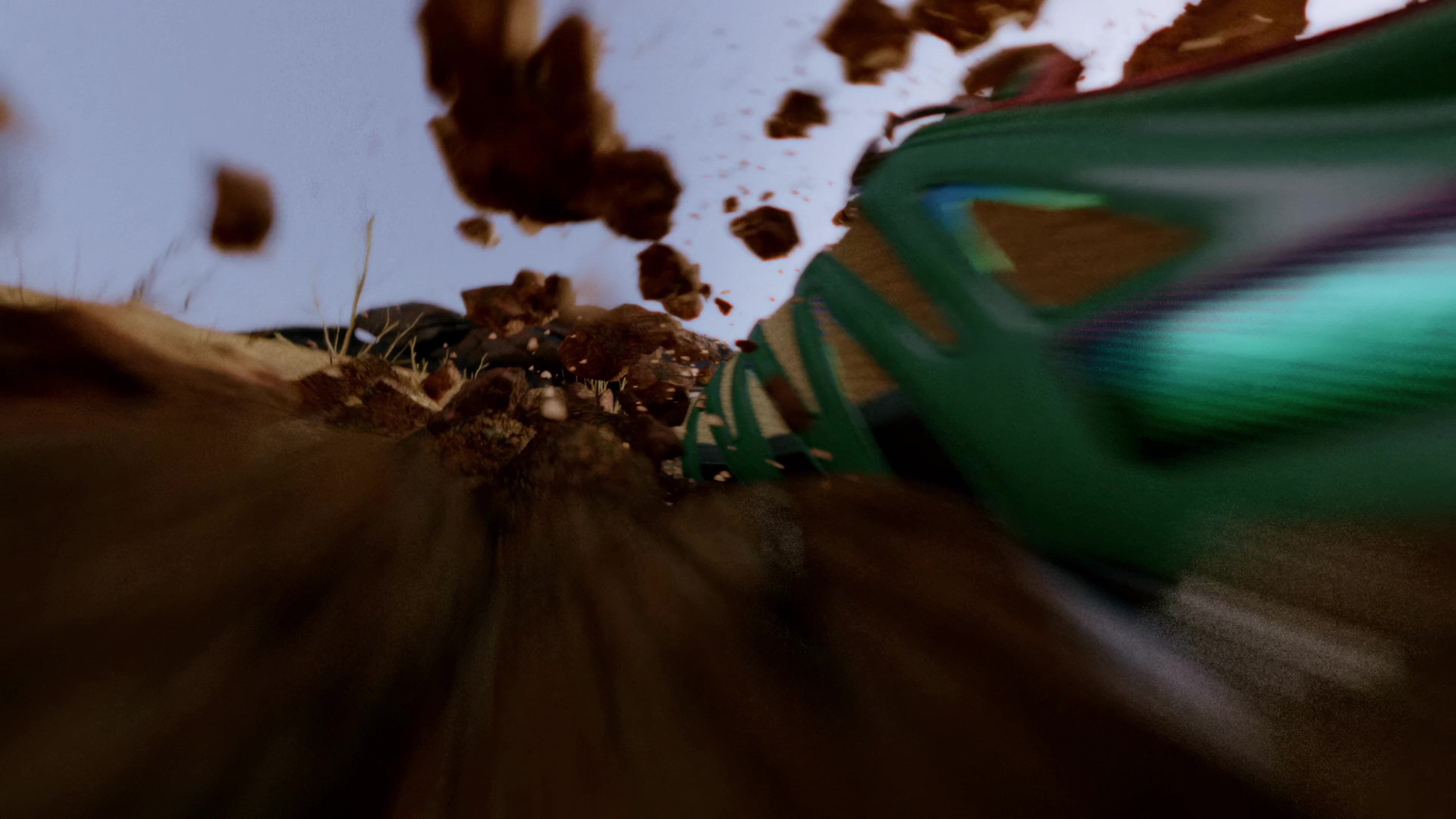
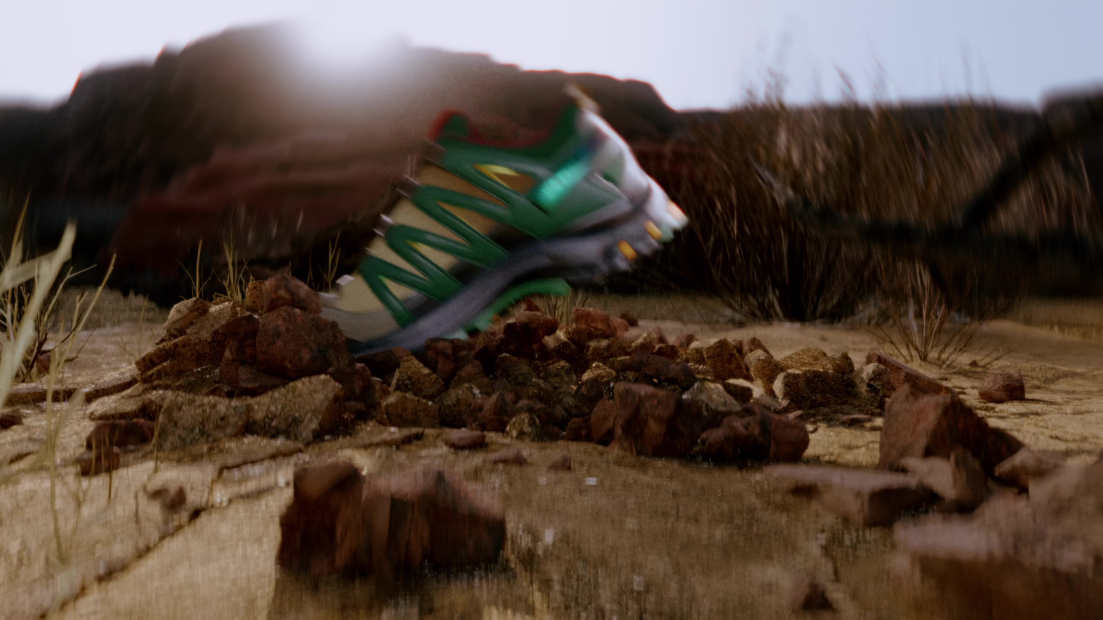
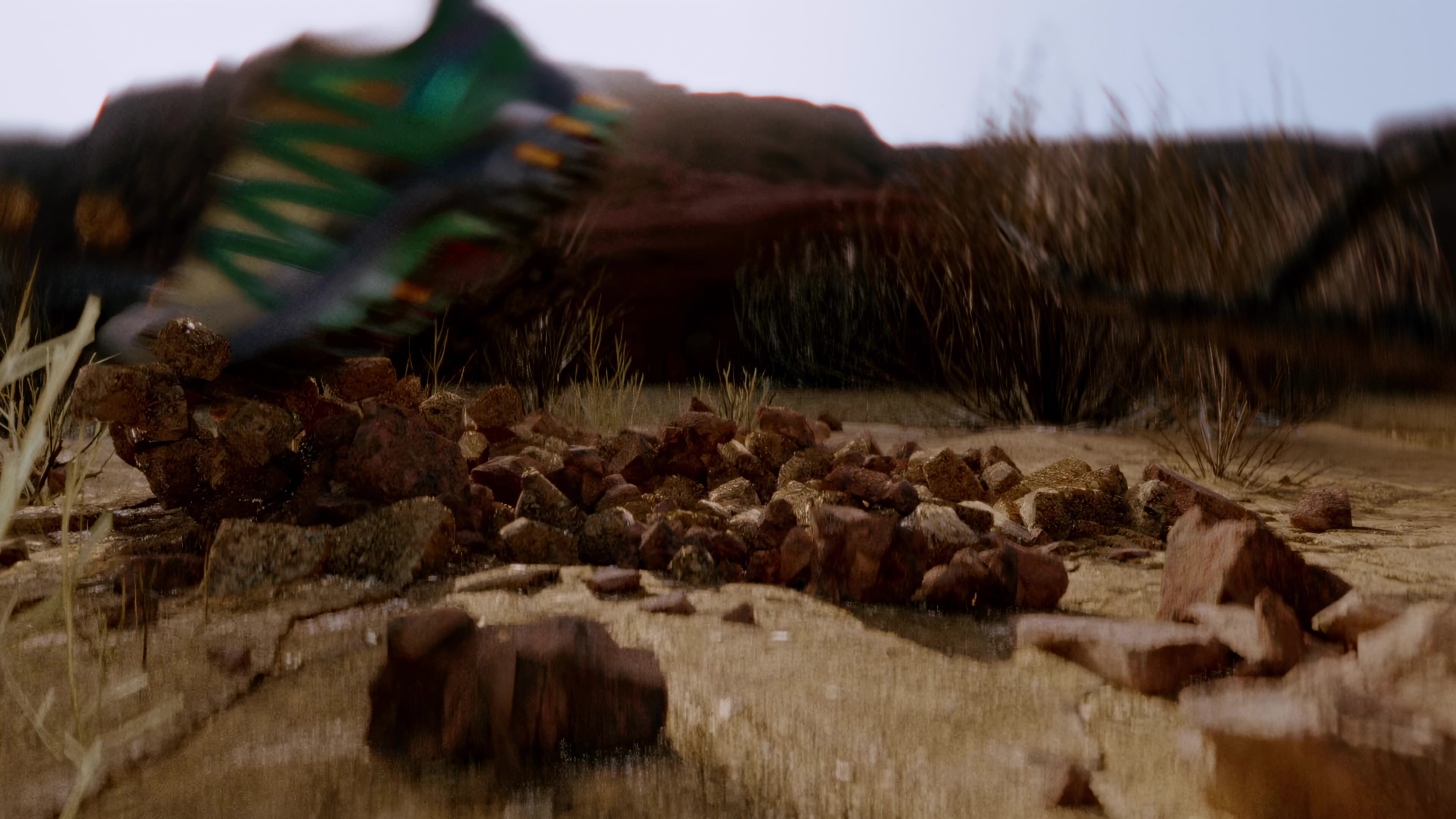
Point of Impact is a speculative campaign for Salomon, made in collaboration with Huy Le to promote their iconic trail running product line - XA Pro 3D. The primary concept "Impact" captured the moment where force meets terrain. Seen through the eyes of a trail runner, the ground is alive. Shifting and challenging. The XA Pro 3D meets every impact with control and precision, letting you stay connected to the trail and focused on the run, whatever the weather, wherever the path leads.
This collaboration gave us space to push both creatively and technically, learning along the way and growing stronger as a team. The result is a campaign series where we could experiment freely, evolve our process, and sharpen our voice as visionary 3D artists.
This collaboration gave us space to push both creatively and technically, learning along the way and growing stronger as a team. The result is a campaign series where we could experiment freely, evolve our process, and sharpen our voice as visionary 3D artists.
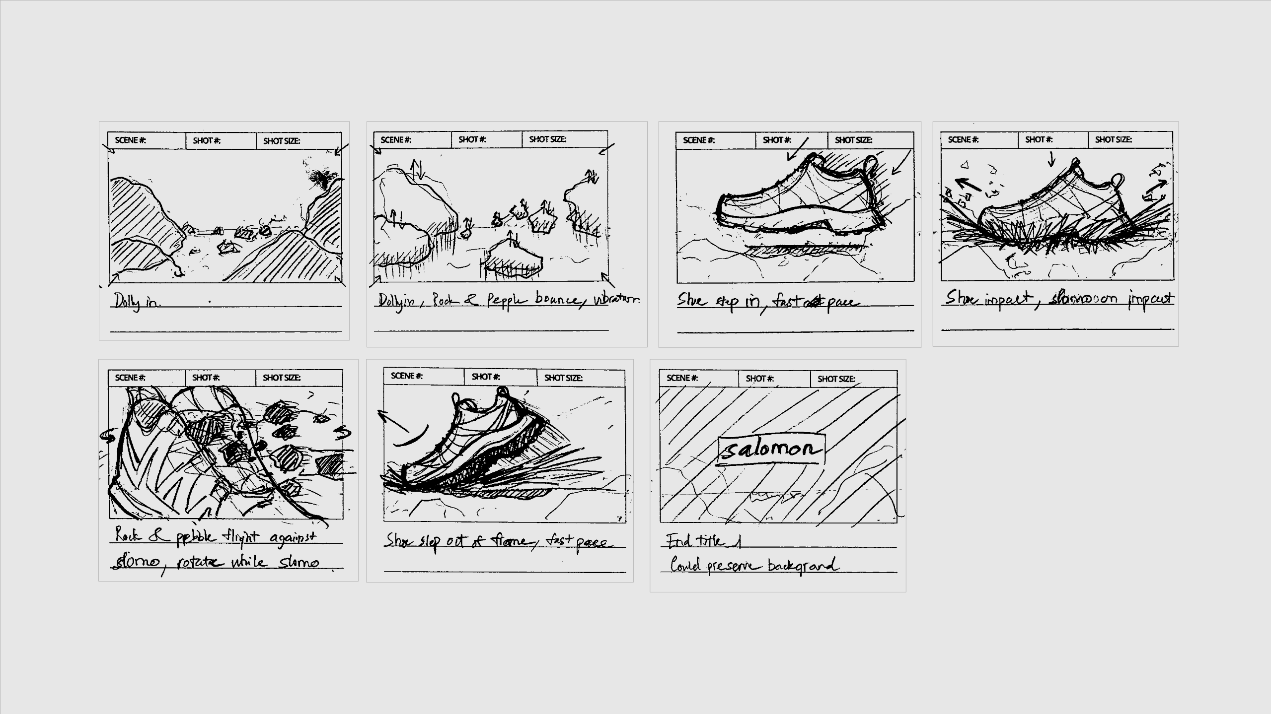
Storyboarding
To bring the “impact” concept of the XA Pro 3D to life, we started in pre-production by exploring how the story could be told visually through storyboarding. The impact is exaggerated through a bug’s-eye perspective, turning each moment into a dramatic experience while showcasing the performance, details, and character of the trail-running sneaker.
Process
To push the idea of strong impact and exaggerated collisions, we had fun experimenting with RBD simulations in Houdini as part of the animation. The toolset gave us the freedom to try out different physical behaviors to best express the concept. Working back and forth between Cinema 4D and Houdini also helped us better understand the strengths of each software and how to use them together.
Credit
Huy Le
Model Texturing
Camera Movement
Look Development
Sound Design
Rendering
Rock Debris Simulation
Compositing/Color Grading
Model Texturing
Camera Movement
Look Development
Sound Design
Rendering
Rock Debris Simulation
Compositing/Color Grading
Giang Ho
Concept/Storyboarding
Ground Break Simulation
Scene Environment Design
Model Animate/Rig
Graphic Title
Look Development
Concept/Storyboarding
Ground Break Simulation
Scene Environment Design
Model Animate/Rig
Graphic Title
Look Development
Infinite Emotion
Agency
Saint-Tran Studio
Visual Design
Giang Ho
Saint-Tran Studio
Visual Design
Giang Ho
Infinite Emotion is a visual series designed as an emotional brand wall for an internal event. I was reached out by the team at Saint-Tran Studio to bring the concept to life. Based on the provided art direction and core themes like Adventurous, Power and Reinvention, Flavor and Quality, and Connection. I approach exploring the visual to align with the brand’s identity through expressive abstraction, bold composition, and high contrast. Each element was crafted to work in harmony, creating a cohesive visual language that functions as an immersive background experience.
The result is a continuous looping sequence of visuals that reinforces the brand’s emotional presence throughout the event.
The result is a continuous looping sequence of visuals that reinforces the brand’s emotional presence throughout the event.
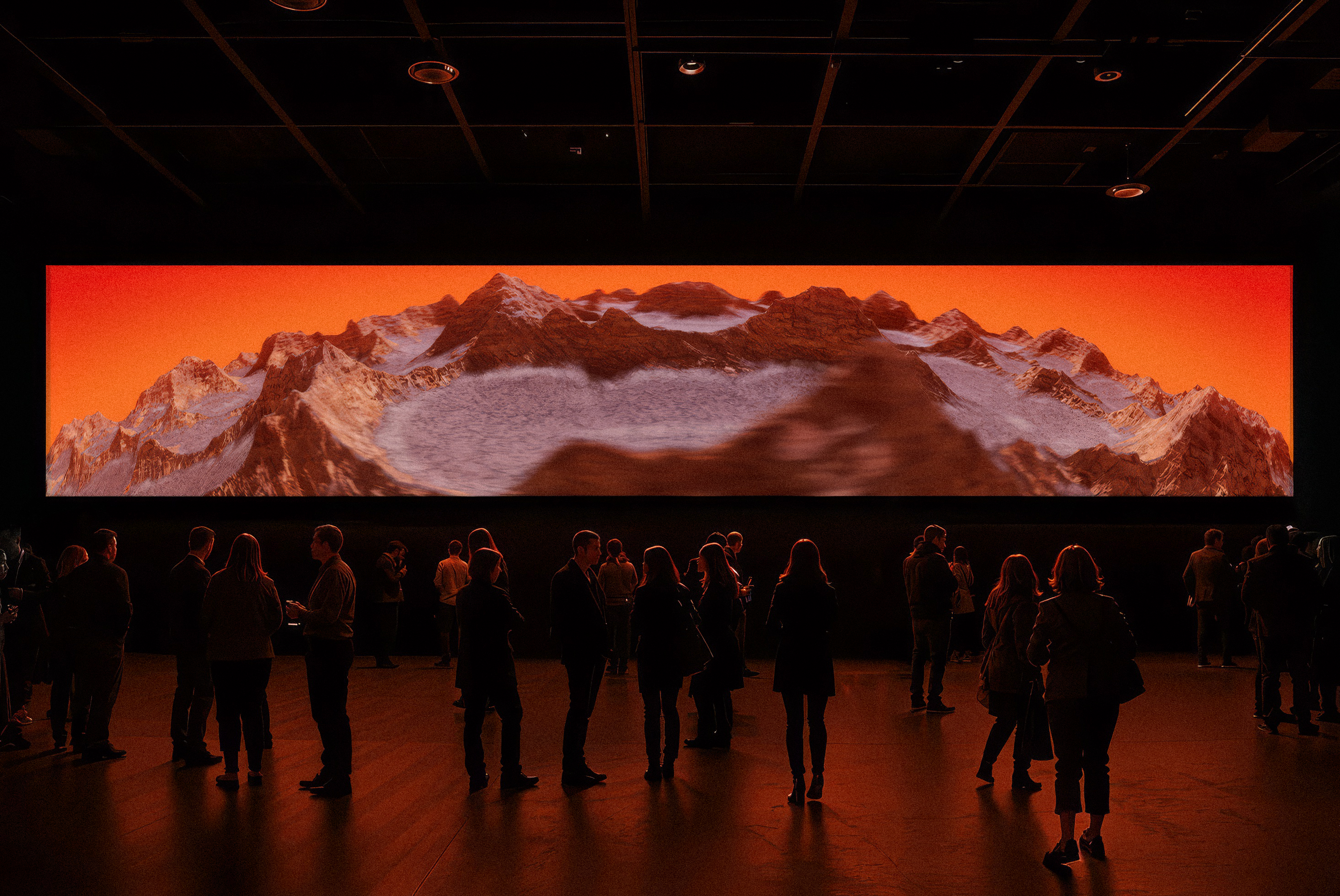
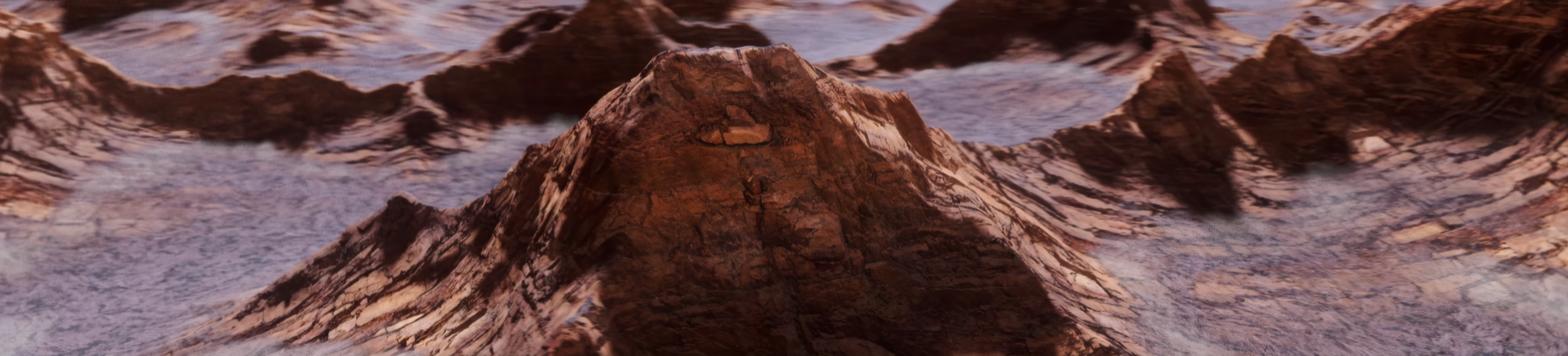
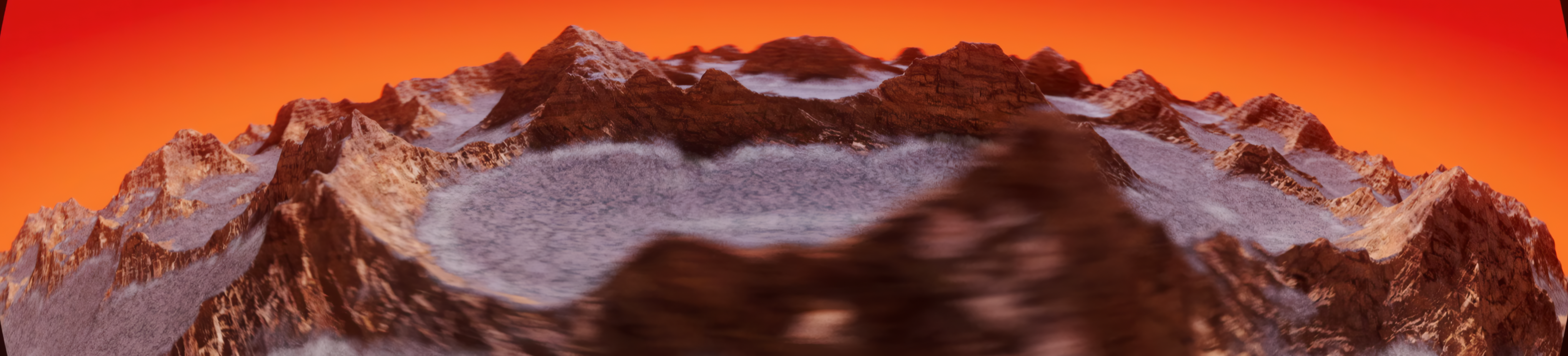
Emotion 1
Adventurous
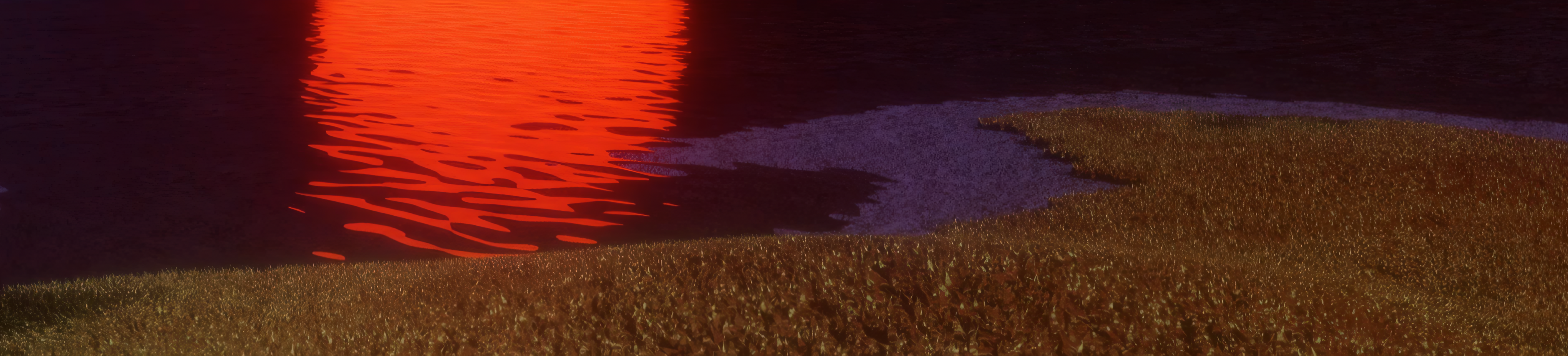
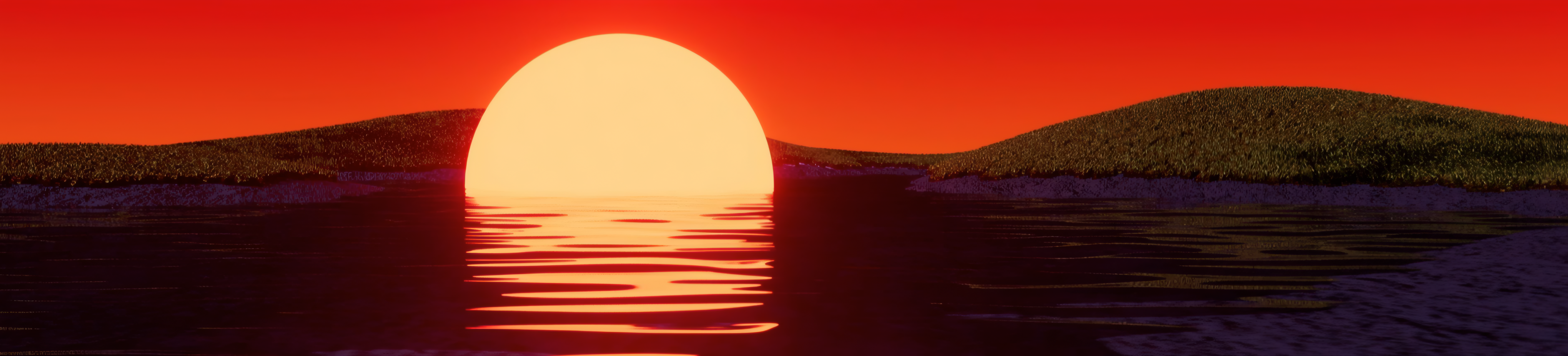
With the first keyword, Adventurous, the concept aims to convey the feeling of a vast, mountainous odyssey driven by determination and a spirit of exploration. The crafted landscape represents this journey, symbolizing the pursuit of discovery for those willing to venture beyond horizons.

Emotion 2
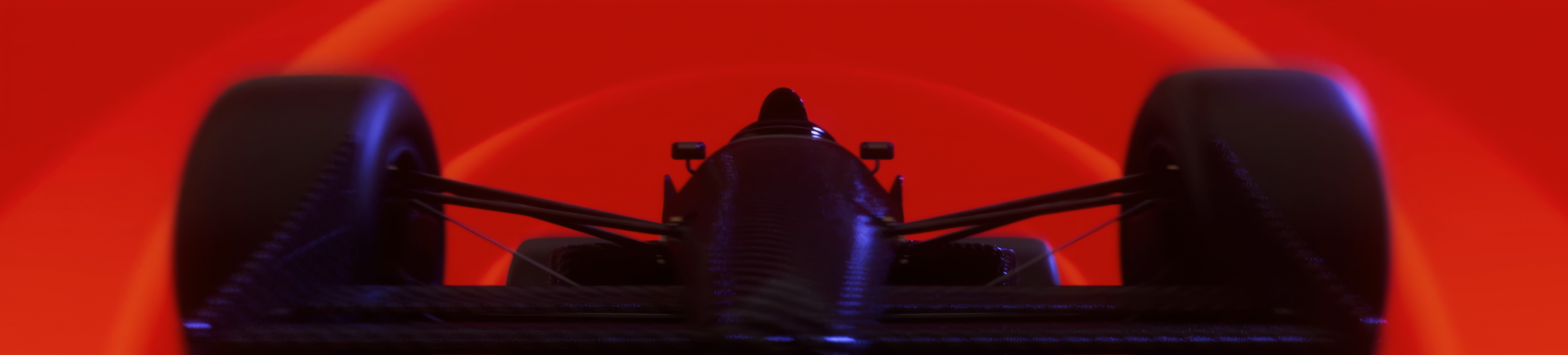
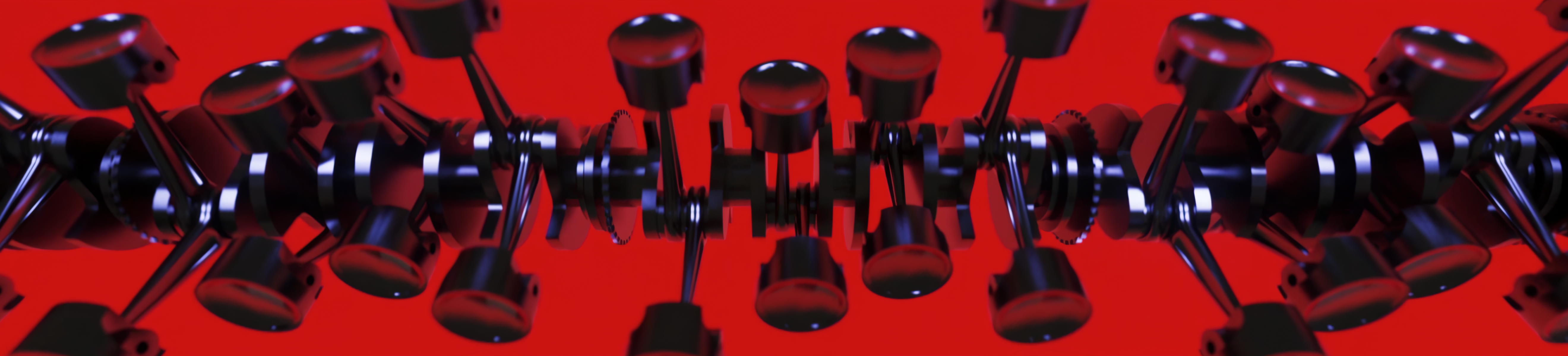
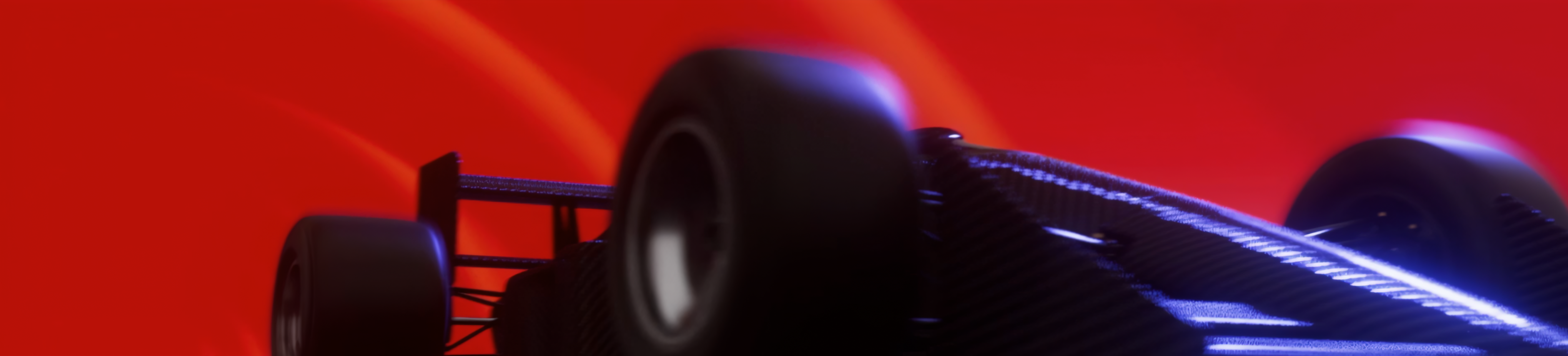
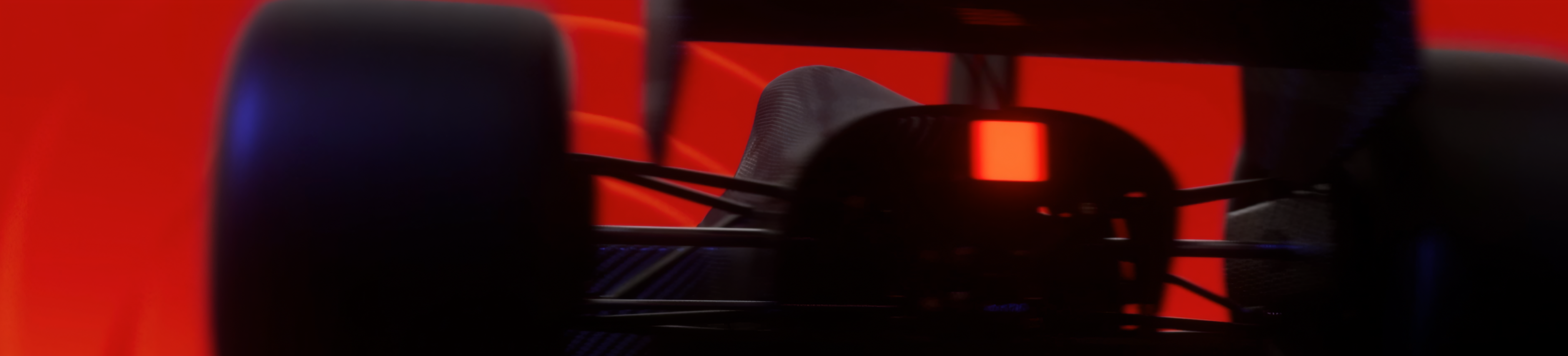
Power &
Reinvention
Reinvention
With the second pair of keywords, Power and Reinvention, the visuals symbolize the brand’s legacy as a pioneer in the field of high-speed sport, while also reflecting its reputation for innovation and its constant drive to push boundaries. These qualities are embodied in the silhouette of a racing car, combined with abstract imagery of an internal combustion engine in motion, evoking a sense of raw power and momentum.
Emotion 3
Flavor &
Quality
Quality
With the third keyword pair, Flavor and Quality, the visuals evoke a sense of openness and airiness, serving as a metaphor for freedom and liberation.
Emotion 4
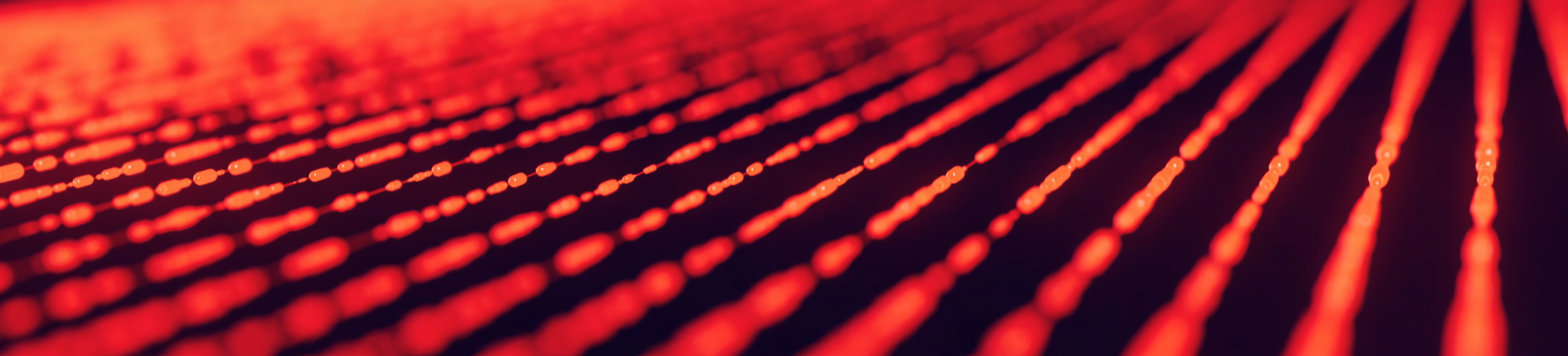
Connection
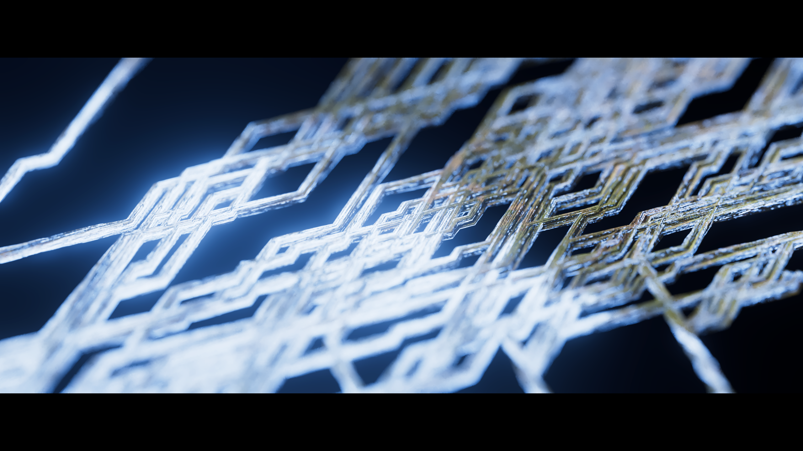
With the fourth keyword, Connection, a network of abstract lines moves with an organic, breathing rhythm, expressing a natural sense of interconnection. The camera flows through the space, revealing the connections as they come together.

Process
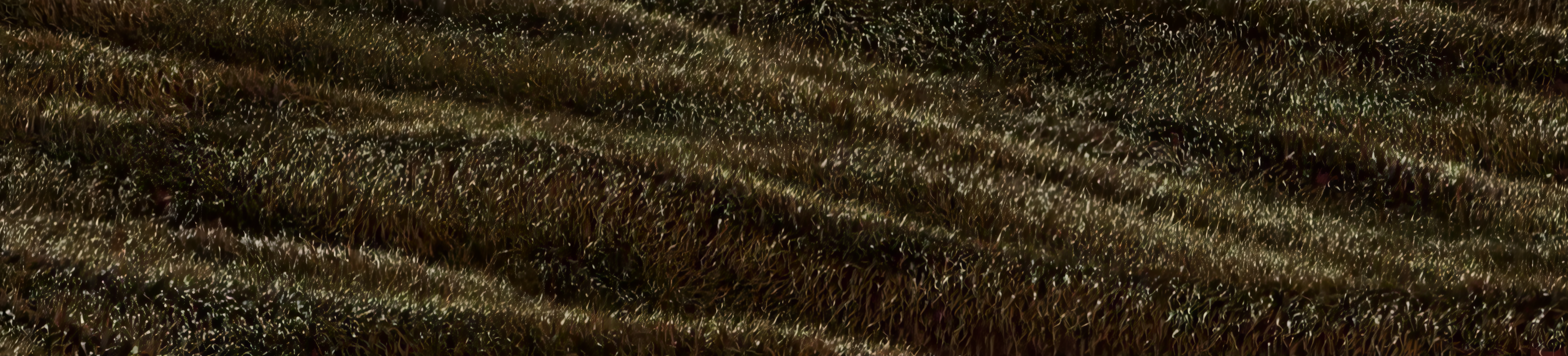
In this project, I had the chance to explore a wide range of visuals, from building mountainous terrain with Houdini Heightfields (an incredibly flexible and powerful tool). To rigging camshafts and pistons. I also experimented with simulating vast grass fields with subtle, wave-like motion. Creating abstract matrix forms that carry signals and energy through an organic, breathing rhythm.
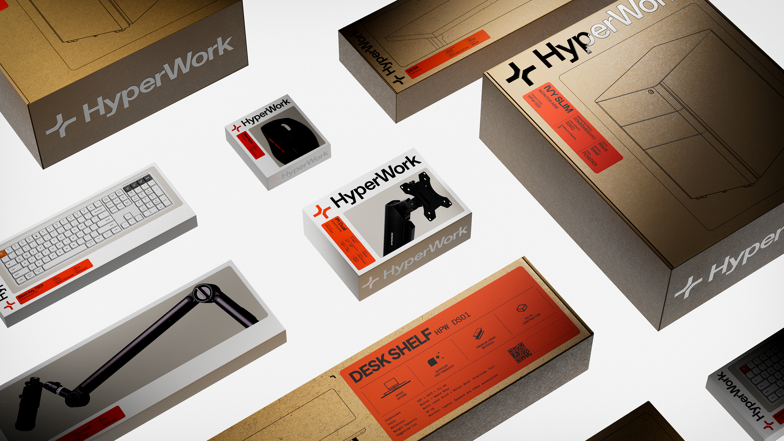
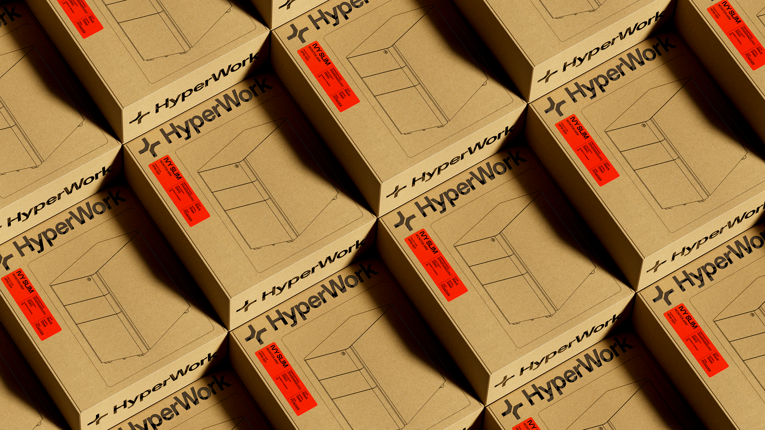
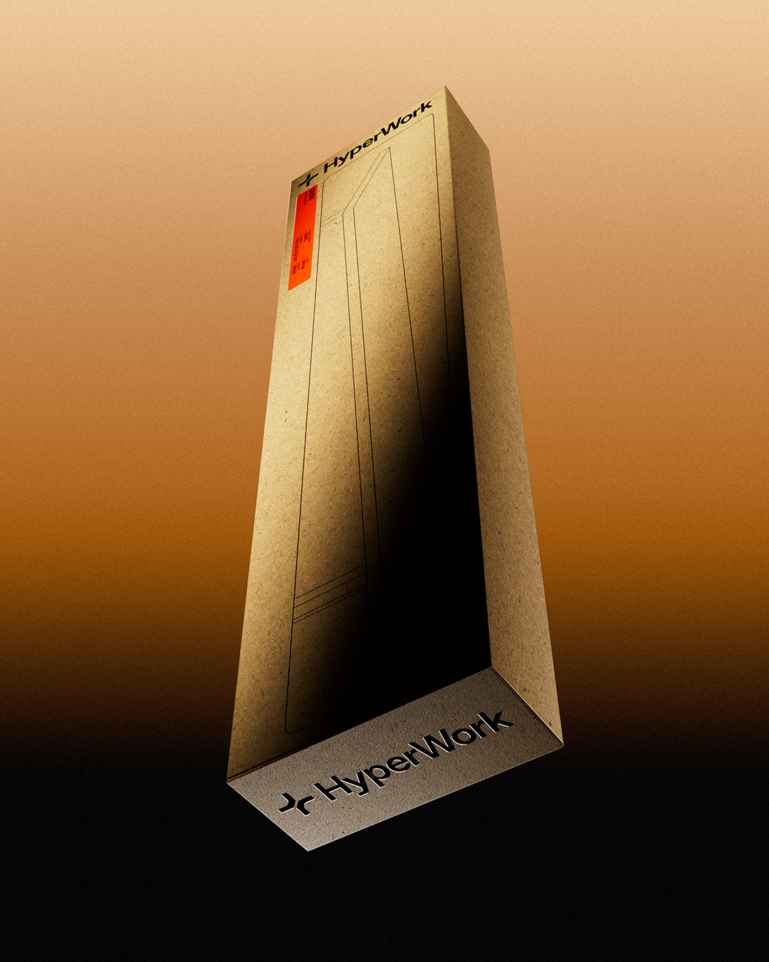
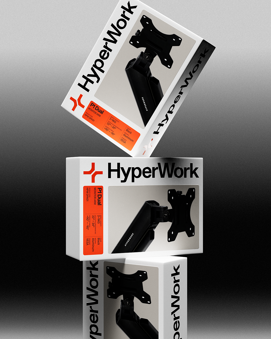
Hyperwork Rebrand
Packaging Showcase
Packaging Showcase
Scope of work
3D Visualization
Designers
Hieu Vo
Thinh Tran
3D Visualization
Designers
Hieu Vo
Thinh Tran
HyperWork started with a simple idea: build better workspaces for a new generation. What began as a wooden wrist rest quickly grew into a full ecosystem of ergonomic tools — from desks and chairs to modular accessories and peripherals.
For this rebranding project, I’m helping bring to life a full range of thoughtfully designed packaging. With the brand’s mission focused on creating better workspaces through a connected ecosystem of accessories, the visual direction leans toward simplicity, clarity, and practical elegance. My goal is to reflect those qualities in a clean and cohesive packaging presentation. The full rebranding case study can be viewed HERE.
For this rebranding project, I’m helping bring to life a full range of thoughtfully designed packaging. With the brand’s mission focused on creating better workspaces through a connected ecosystem of accessories, the visual direction leans toward simplicity, clarity, and practical elegance. My goal is to reflect those qualities in a clean and cohesive packaging presentation. The full rebranding case study can be viewed HERE.
NUEN MOTO
Timeless Vision
Timeless Vision
Design Contest
NUEN MOTO
Scope of work
Short Film/Animation
NUEN MOTO
Scope of work
Short Film/Animation
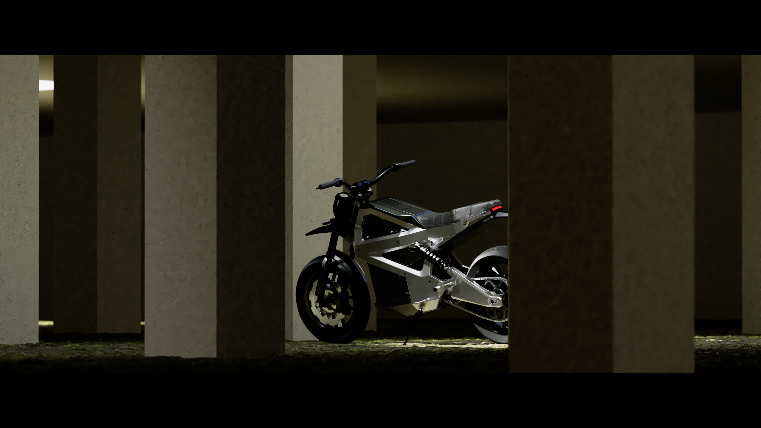
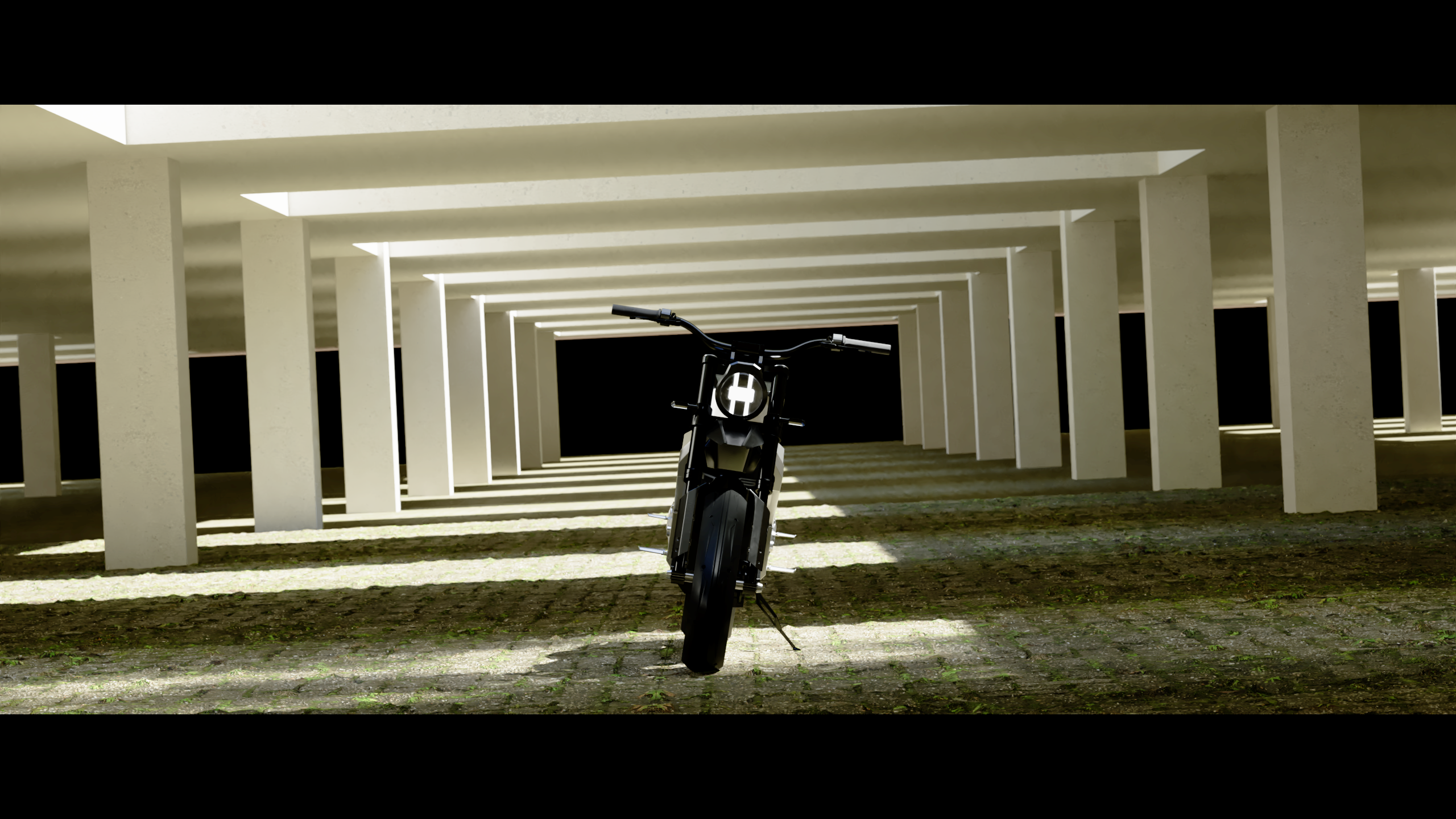
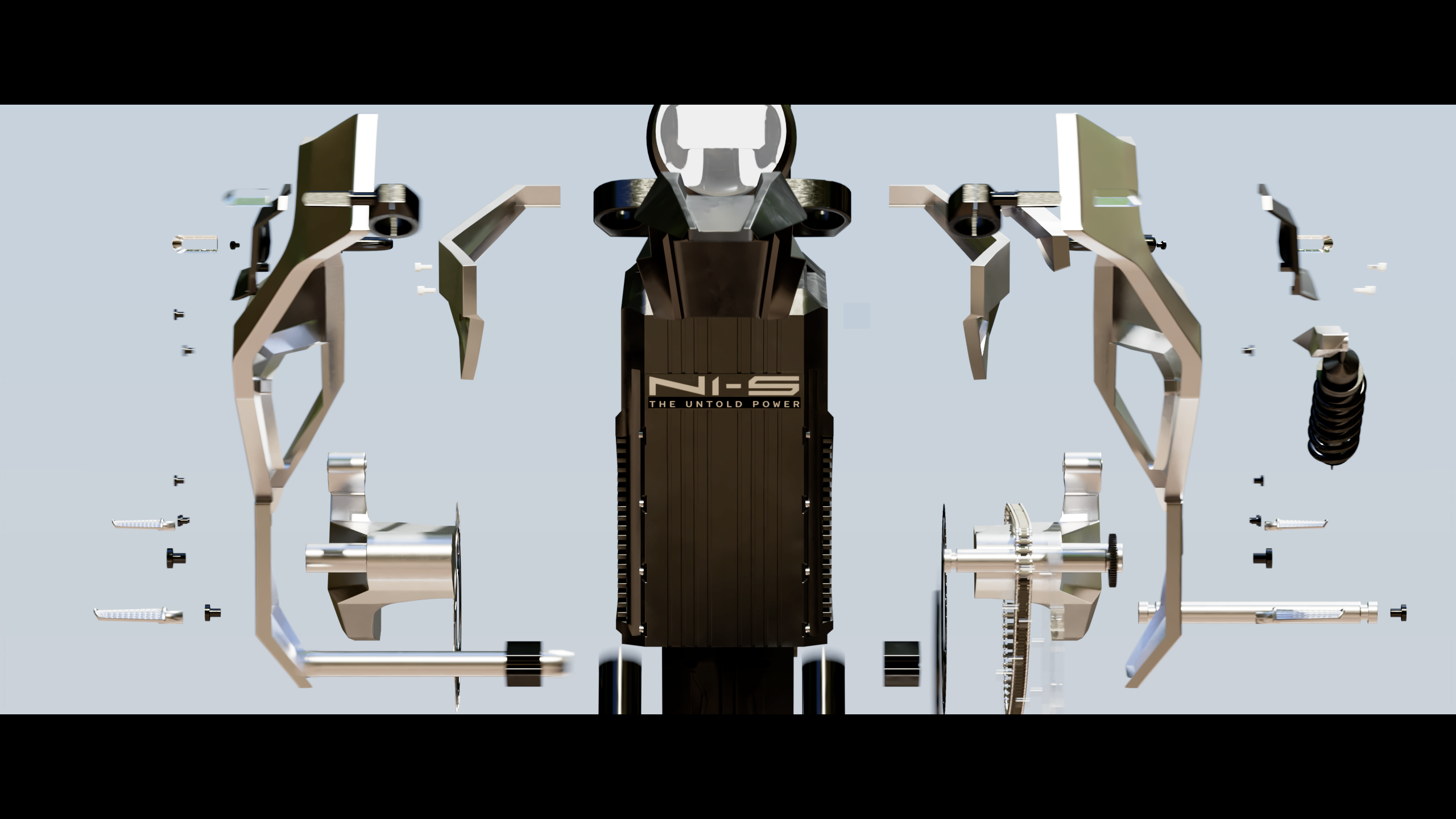
NUEN MOTO is a startup founded on the belief that purposeful, human-centred design can reshape mobility—and, in turn, the world. Driving that change incrementally, running the business with Scandinavian-inspired efficiency and rigorous financial discipline. Cultivating proprietary core technologies and reinforcing their own manufacturing capability. Embody the modern Vietnamese spirit—daring, innovative, and deeply connected to both heritage and the future.
Celebrating Vietnam’s 2050 Net-Zero Target, NUEN MOTO held a design contest at the end of 2024 where artists and designers share their vision of a clean futuristic Vietnam companing with NUEN MOTO’s signature bike model N1-S.
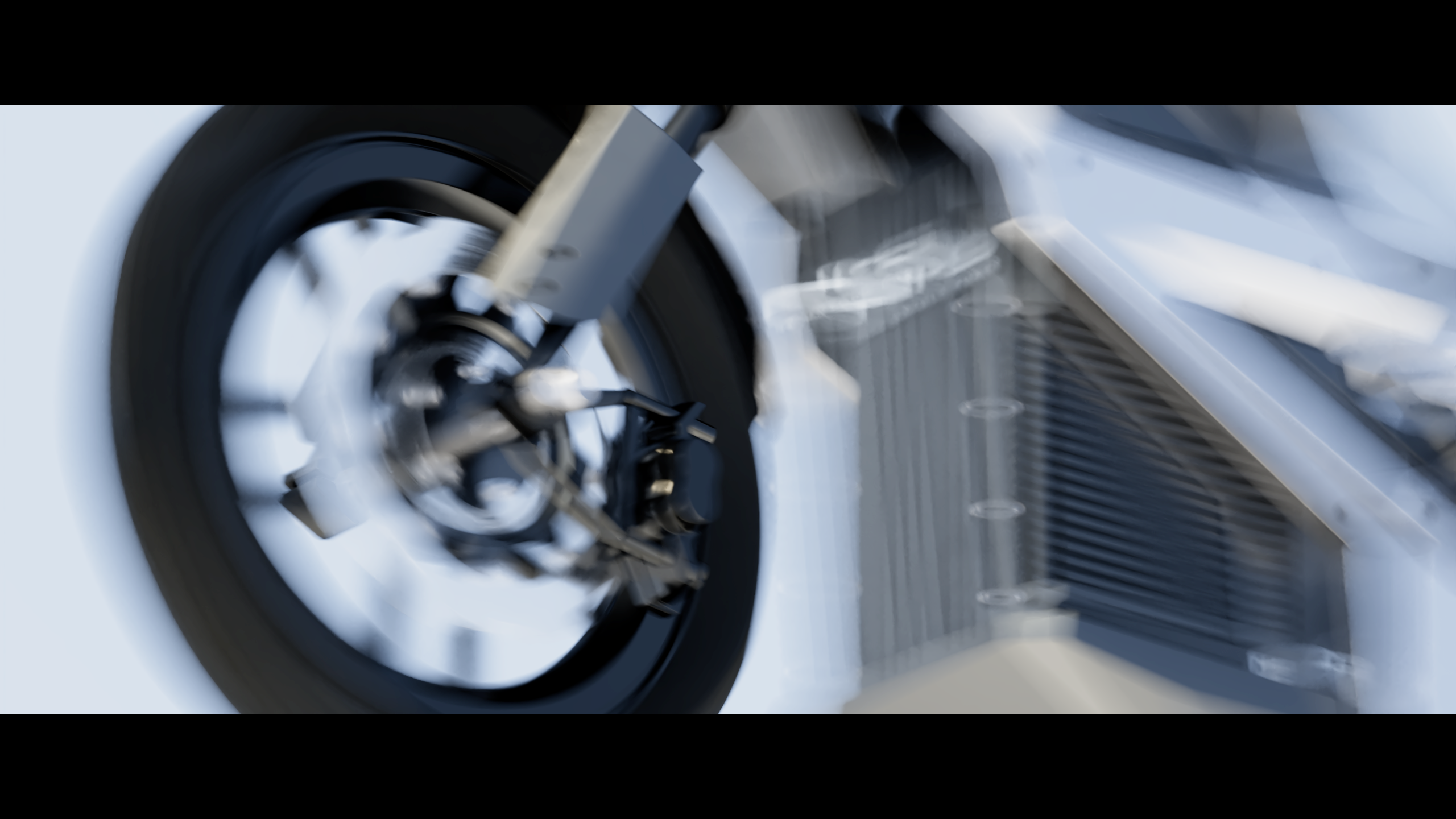
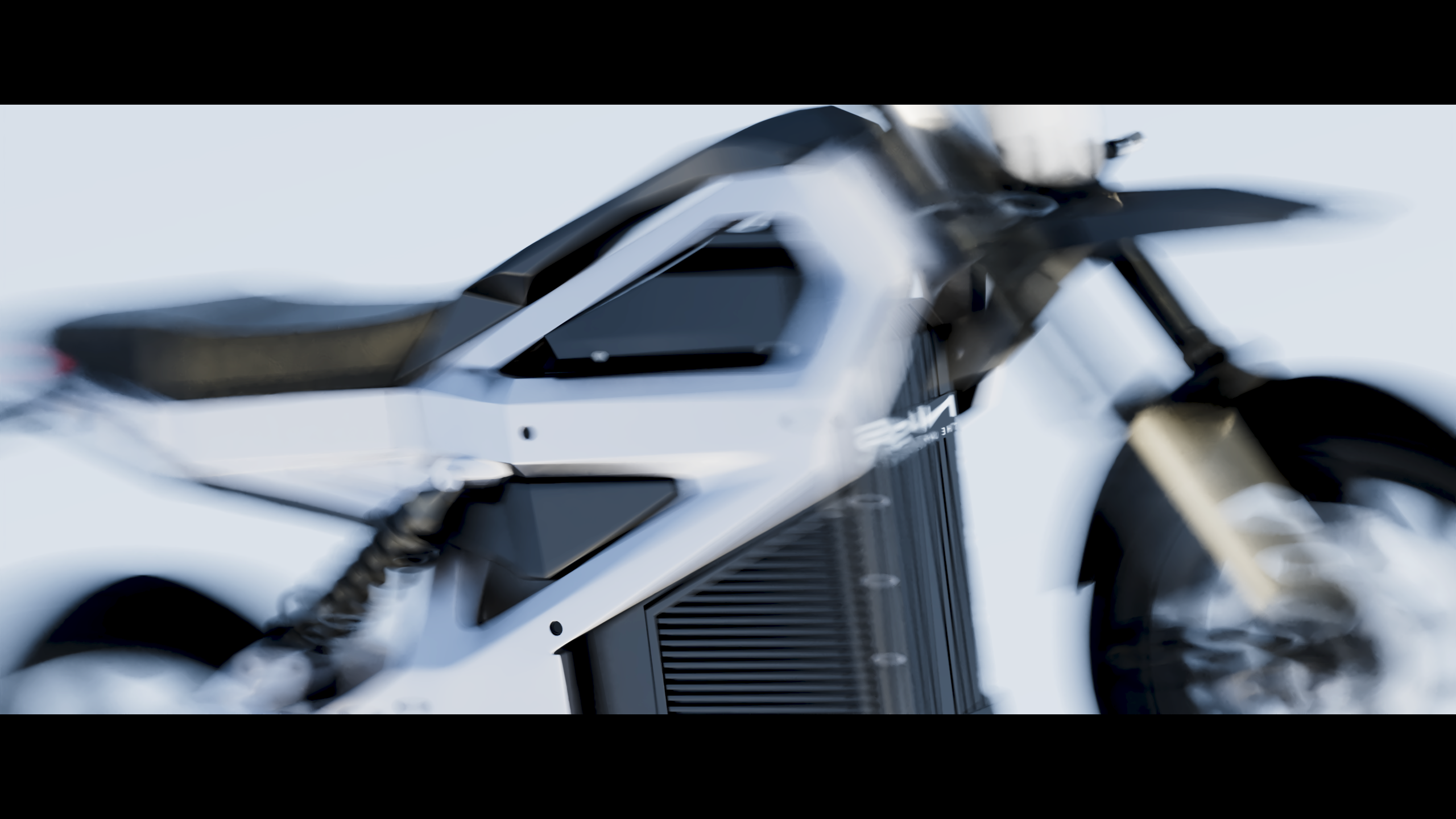
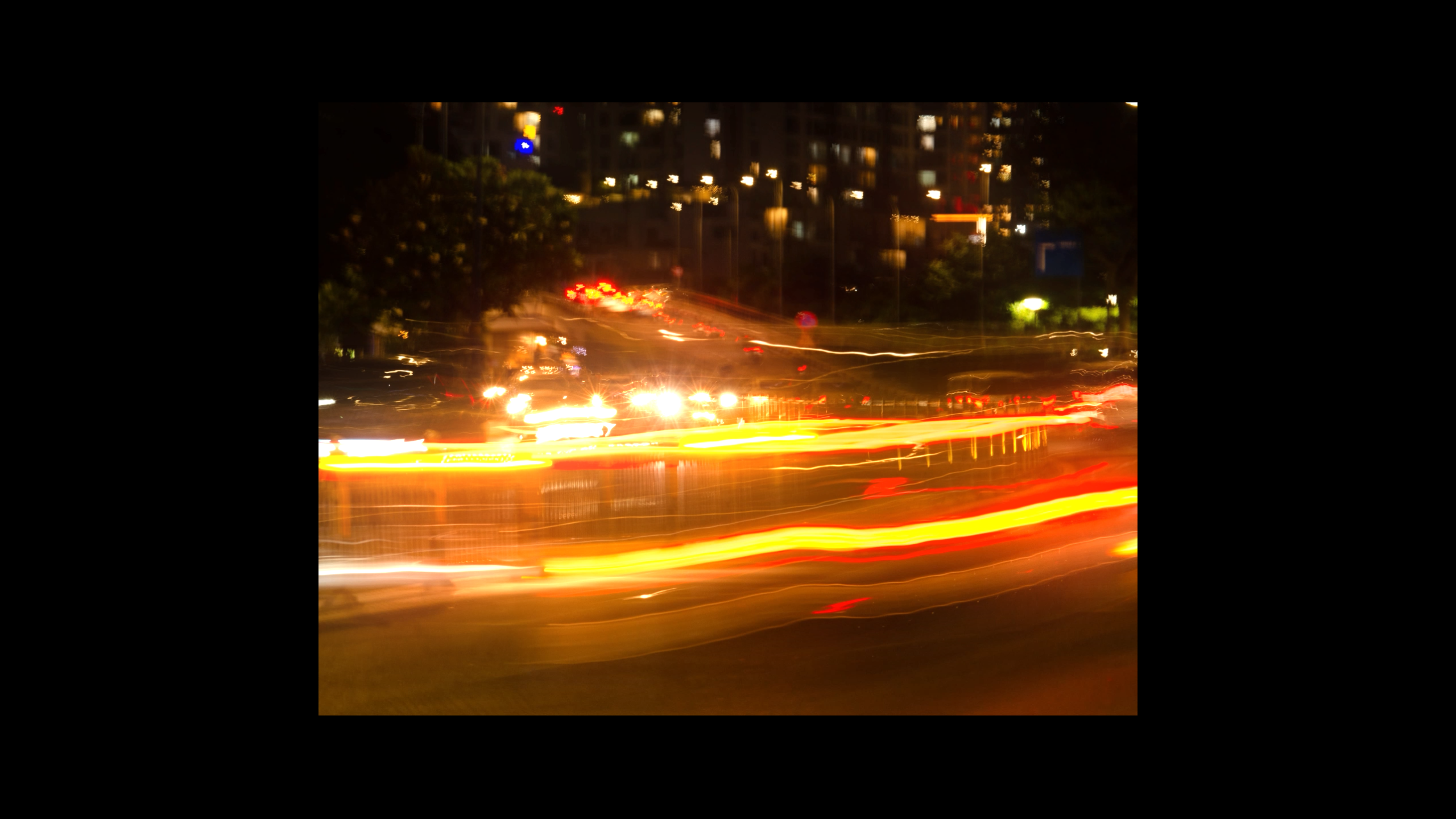
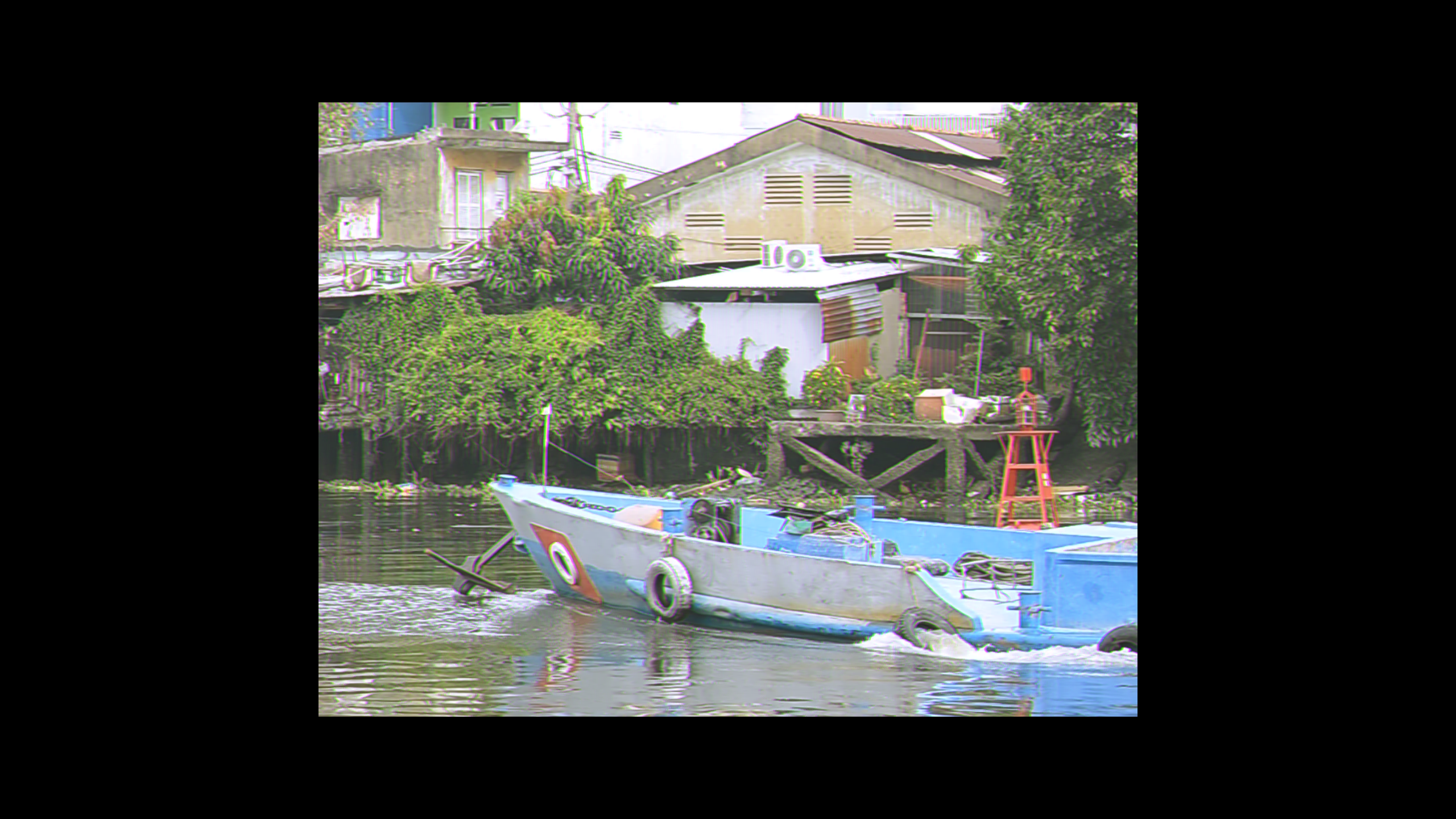
For my entrance piece, I created a short animated film called Tuan Hoan—which means “repeat, loop.” The film imagines a future where electric batteries can be reused to power a city’s infrastructure, then recycled and brought full circle back into N1-S batteries. It’s a vision of an energy cycle that creates no waste and gives back to the environment. In this work, I wanted to combine both CGI scenes and real life footages that I captured around Ho Chi Minh City to convey a sense of honest and realism to the animation.
Celebrating Vietnam’s 2050 Net-Zero Target, NUEN MOTO held a design contest at the end of 2024 where artists and designers share their vision of a clean futuristic Vietnam companing with NUEN MOTO’s signature bike model N1-S.
For my entrance piece, I created a short animated film called Tuan Hoan—which means “repeat, loop.” The film imagines a future where electric batteries can be reused to power a city’s infrastructure, then recycled and brought full circle back into N1-S batteries. It’s a vision of an energy cycle that creates no waste and gives back to the environment. In this work, I wanted to combine both CGI scenes and real life footages that I captured around Ho Chi Minh City to convey a sense of honest and realism to the animation.